.
Showing posts with label surface temperature. Show all posts

Monday, July 11, 2016

Australasian temperatures are unusual in the context of the last thousand years - Joëlle Gergis

Sou | 6:19 PM Go to the first of 53 comments. Add a comment
You might recall how four years ago science deniers, led by that unsavory character Steve McIntyre, went beserk over a paper by Dr Joëlle Gergis and a team of scientists. The paper was originally published in Journal of Climate but the authors requested it be put on hold. What the researchers were reporting was that recent decades of temperatures recorded in Australia were warmer than at any time in the past millennia.

The paper has now been taken off hold and has been published in the latest issue of the journal. About the paper, Joelle Gergis has said:
We found that the nature of warming experienced in Australasia since 1985-2014 is unusual in the context of the last thousand years...Analysis of climate model simulations shows that the warming experienced since 1950 cannot be explained by natural factors alone, highlighting the role of human caused greenhouse gases in the recent warming of the region.

In the paper the authors describe research looking at proxy reconstructions of temperatures in the warm season in the Australasian region between 1000 and 2001 AD (see Figure 1 below). Since then Australia has got even hotter. The paper is very detailed and interesting, including discussion of the temperature changes over time. For example, the authors point out that in medieval times, warming occurred in the Australasian region later than in parts of the northern hemisphere. However the timing of the minimum temperatures in the Little Ice Age was similar to that in the northern hemisphere.

I'll let Joëlle Gergis tell the rest of the story, from her article at The Conversation. It's not just a story about the research, it's also about sexism, FOI harassment, and general misbehaviour of the sort the world has come to expect from "climate hoax" conspiracy theorists.

Saturday, March 19, 2016

Too much heat: Anthony Watts is becoming a greenhouse effect denier

Sou | 7:27 PM Go to the first of 6 comments. Add a comment
Anthony Watts is protesting the record heat so much his brain must be hurting. He's been stuffing his blog with protests. I can't tell if it's because he's got nothing else to fill up his daily quota, or if it's that he's really disturbed by the record heat. In a very mixed up article (archived here), Anthony once again protests. He keeps mixing up USA surface temperatures with global. I wonder does he know the difference? He is also starting to show strong signs of denying the greenhouse effect, which up till recently he vowed he "believed" in.

Yesterday he posted another dumb article (archived here) protesting the record hot year, using a tweet from Andy Revkin about an article by Seth Borenstein as his excuse. He didn't post a link to either the tweet or the article. All he did was post an image of the tweet. So it's a fair bet that he didn't want his readers to read it.

Today he's made up two lies in his headline:
NOAA declares current El Niño stronger than 1997-98 event, then says record warm temperatures have little to do with it
First of all, NOAA didn't declare that the current El Nino was stronger than the 1997-98 event. Secondly, it didn't say that record warm temperatures had little to do with the El Nino (which I think was Anthony's meaning). On the contrary, the article he was referring to said that El Nino did contribute to the record warmth in the USA this winter.

Thursday, March 17, 2016

Denier weirdness: How not to look at temperature changes in USA, with Leland Park at WUWT

Sou | 1:06 AM Go to the first of 6 comments. Add a comment
There's a very weird bit of denier weirdness at WUWT today. It's from some bloke called Leland Park. He's put together some charts and is, I think, protesting the warming of the USA (archived here). I'm not sure about that because his article is very odd. I've read it twice and then read it again and I still can't figure out what point he is trying to make.

I'll go through what he did and see if anyone here can help me out. Leland started off with an equation that he's obviously quite proud of. He wrote it like this:
the relationship between the heat content of a substance and changes in its temperature is given by:
Q = m * c * ΔT
where m is the mass and c is the heat capacity of the substance being measured

Wednesday, March 9, 2016

Record-breaking hot years almost impossible without humans - and Anthony Watts' conspiracy theory

Sou | 3:07 PM Go to the first of 15 comments. Add a comment
Recent record hot years are almost impossible in the absence of human-induced forcings, a new study shows once again.  A multi-national team of scientists led by Andrew King from the University of Melbourne did a study of hot weather years, and found human influences on heat extremes going back to the 1930s globally, and earlier in some places. The new paper has just been published in Geophysical Research Letters.

Anthony Watts, a climate conspiracy blogger at WUWT, didn't read the paper, but he decided it made unfounded claims (archived here). Anthony decided, in his foolishness, that the team, led by a University of Melbourne scientist, and including other researchers from Universities in Melbourne, South Korea, Switzerland, Oxford UK, New Zealand and the New South Wales, must be wrong because Professor Chris Turney (not an author) led an expedition on a ship that got caught in the ice in Antarctica a couple of years ago. Need I say more about the weirdness of science deniers?

Record hot years influenced by human activity - going back to the 1930s globally


The authors weren't looking at heatwaves (a duration of days), they restricted their study to timescales of at least a month. They performed an analysis of hot years looking at the globe as a whole and selected regions. They found that by using the technique knows as Fractional Attributable Risk (FAR), they could determine years in which there was a detectable anthropogenic influence on especially hot years globally and in different regions of the world.

Saturday, February 20, 2016

Anthony Watts finds another squirrel in Arizona when he knows there is no bias

Sou | 1:35 PM Go to the first of 10 comments. Add a comment
Anthony Watts is busy looking for squirrels in Arizona to distract from all the record high temperatures. He's found another poorly sited weather station (archived here). Without acknowledging that his previous find wasn't used in any dataset, national or global, he is delighted to find that this one is. It's located at the small town of Parker in north-western Arizona near the border of California.

Parker 26250 is included in the GISTemp global data set up until 2007. It is also included in the NOAA USHCN dataset. There are quite a few quality problems with it, as shown at Berkeley Earth. There is missing data, it's very poorly sited, and it's had several replacements of an MMTS sensor.

The issue is not that there are poorly sited weather stations in the data sets. The question is: are they biasing the record?

The answer would be a resounding NO! They are not.

NOAA now uses a lot of data in its official CONUS dataset, nClimDiv, and uses sophisticated algorithms to correct wonky data and present the information on temperature as close as it can. It must be quite good, because there is very little difference between its pristine record of its Climate Reference Network (CRN) and the larger dataset (ClimDiv) as you can see below. I've highlighted where there are the biggest differences and they are miniscule:

US CRN and US ClimDiv January to December annual data from 2000 to 2015 Source: NOAA

Tuesday, December 29, 2015

More about the hot weather in North America, and more

Sou | 11:59 PM Go to the first of 67 comments. Add a comment
In the comments today, under the article about the extreme weather around the world these past few days, there was a claim that "It was warmer in the US in 1955". There was nothing else except a link to two maps of the USA. The top map was labeled 2015 and the bottom map was labeled 1955. The maps were coloured but there was:
  • no legend
  • no date
  • no information that would explain anything about what the charts were meant to represent.

That sort of behaviour is more common on denier blogs than it is here at HotWhopper. Anyway, it prompted me to do some reading and research, and in the process I got diverted a bit into US temperature records, and trends in diurnal temperature range. So this article is a bit of a wander, and a bit long.


How hot was it in 1955 in the USA?


First, though, let's see about the very short and somewhat cryptic comment from HotWhopper reader, Andy Wilkins. He wrote that it was warmer in the US in 1955. But was it? No, it wasn't. At least not if you are looking at mean annual surface temperatures.

Below is a chart showing the annual mean surface temperature for the contiguous USA from 1895 to 2015 (average to November). I've marked the mean temperatures for 1955 and 2015, and this year so far is 1.31 °C hotter than the annual mean temperature in 1955.

Data source: NOAA ClimDiv

Now if Andy had somehow mistaken 1955 for 1954, then the difference between then and now would have still been 0.41 °C . That is it's been 0.41 °C hotter this year so far than it was back in 1954. (Note: The US temps and chart were corrected shortly after posting.)

Friday, December 18, 2015

Anthony Watts' #AGU15 poster on US temperature trends

Sou | 7:26 PM Go to the first of 64 comments. Add a comment
Credit: NOAA
Anthony Watts has a poster at this year's AGU Fall Meeting. He is very proud of the effort he made (his WUWT article is archived here). He is also looking over his shoulder, fearful of a conspiracy to stop him from publishing. Actually, Anthony's main contribution seems to have been organising other people to do the work, which is a talent well worth having.

Anthony has made his poster available for downloading from his own website, though it's not available on the AGU15 website (yet). His press release is on the AGU website. The poster has some gaps that could be important. But first, what does it show.


Watts' US surface station temperature trends (revised)


According to the poster, the researchers took the following steps with US temperature records dating between 1979 and 2008. First they removed all weather stations that had been moved or had had a change in time of observation. They classified the remainder using one (not all) of the criteria set out in Leroy (2010), specifically "proximity to artificial surfaces, buildings, and other such objects with unnatural thermal mass".

Monday, September 28, 2015

Improving the temperature record vs conspiracy theories at WUWT

Sou | 2:02 PM Go to the first of 21 comments. Add a comment
Over the years, scientists in different parts of the world have worked hard to get a more accurate picture of the change in global surface temperature over time. This is slow painstaking work. Initially it would have meant working with written records, with people trying to decipher handwriting of the tens of thousands of people who wrote down readings of temperature and rainfall, and other weather indicators, from all the weather stations around the world. Over time the data was digitised - another extremely laborious task.

I'm not going to write about all that's been done. It's a mammoth ongoing effort involving people from all around the world. What I'm writing about are the ignorant scoffers. You know the people I mean. The ones who sit at their keyboards all day to snipe at the work done by scientists.

Anthony Watts has put up three articles from one chap who's been looking to see the extent of this careful work, as measured by adjustments to the original data. He's only looked at two data sets. One which is used by NASA and NOAA for global land surface temperatures. The Global Historical Climatology Network Data or GHCN. This was first developed in the early 1990s, with the current version 3 released in 2011. The other is the United States Historical Climatology Network (USHCN), which is the high quality dataset used by NOAA for USA temperatures since 1987.

Tuesday, August 4, 2015

Rud Istvan disputes Anthony Watts' surface station findings

Sou | 6:14 PM Go to the first of 8 comments. Add a comment
I notice that Anthony Watts has posted an article (archived here) that disputes his surface station project paper, Fall et al (2011). To be more accurate, Rud Istvan seems to be misrepresenting Anthony's paper - by cherry-picking the bits he likes and ignoring the bits he doesn't. Then Rud gets some facts wrong while apparently trying to "prove" that the global surface temperature hasn't risen this much:


Monday, June 15, 2015

Anthony Watts has discovered pristine US temperature (and MS Excel)

Sou | 7:47 AM Go to the first of 34 comments. Add a comment
Today, after having no opinion on whether or not greenhouse gases work, Anthony Watts has decided to get an opinion. In his opinion the US temperature record maintained by NOAA is pristine. That is, the NOAA Climate Reference Network is pristine. Just how long he'll think it will remain pristine is the question. He wrote an article (archived here) with the headline: "Despite attempts to erase it globally, “the pause” still exists in pristine US surface temperature data"

This time Anthony had nothing but praise for the scientists who work at NOAA. (He did sneak in some snide comments verging on the defamatory by implication. He's got to keep his disreputable reputation intact.) His praise was only because he liked what he saw or he would have hidden it from his readers. He saw a temperature chart from 2005 to 2014 and figured that was good enough for his purposes. Anthony wrote:
But, what if there were a dataset of temperature that was so well done, so scientifically accurate, and so completely free of bias that by its design, there would never be any need nor justification for any adjustments to the data?
Such a temperature record exists, it is called the U.S. Climate Reference Network, (USCRN) and it is also operated by NOAA/NCDC’s (NCEI) head administrator,Tom Karl:

Given that Anthony has been busy for years trying to prove that the record isn't pristine, this is a bit of an about face. Is he admitting defeat? You might think so, mightn't you. Let's come back in five years time, and see if Anthony still says the data is pristine.

Data source: NOAA


Here is a comparison of the pristine with the non-pristine, on an annual basis. I'll let you spot the difference:

Data source: NOAA


OMG. Anthony Watts is right. The USA temperature has paused! Ooh, it's worse than that - it's cooling!

Let's just see how much the USA has cooled over the past 120 years. If you read WUWT you'll probably think the USA is practically in an ice age.

Saturday, August 9, 2014

How to read a global surface temperature chart

Sou | 6:34 PM Go to the first of 16 comments. Add a comment

Someone on Reddit linked to an old HotWhopper article that had some charts, and it got a couple of complaints:
  • Those arrows do a piss poor job explaining the data contained within them. (mythrowaway2000)
  • Some of them go from the average to specific extreme data points. Incredibly misleading even if you do understand the data in the charts. (TheTruthandtheAnswer)

The charts in question were pretty basic. I updated them recently and you can see the updated versions here.

It's easy to forget that there are probably a lot of people who've never studied subjects like science or economics or finance, or worked in an area where charts are commonplace. The above comments underline the fact that there are people who are trying to understand what is happening with climate, but are unfamiliar with charts. So I've made a short video to show what you can glean from a straightforward temperature chart. It's based on GISTemp data from NASA Goddard Institute for Space Studies.


If you click down the bottom right hand corner, you can watch it full screen or on YouTube.

Wednesday, July 2, 2014

Incompetent or deceitful? Anthony Watts is lost for words so substitutes pictures...

Sou | 4:34 PM Go to the first of 19 comments. Add a comment

Update - see below. Judith Curry has decided to join forces with the loony camp. [Sou: 5:30 pm 2 July 14 AESDT]


This is a follow-up to Anthony Watts idiocy with regard to the US temperature record. You can read about his lead up tantrums here and here.

After all his mistakes of the past few days, topped off by this latest gaffe, Anthony Watts' reputation as far as the US temperature records go should be in tatters. Except he has no reputation with anyone who counts for anything. He's just another denialist blogger.

Lost for words


Today Anthony Watts is lost for words. So lost that when he found out that NCDC/NOAA had responded to a query from Politifact, he just posted the response "without comment" (archived here). The response from NCDC was, unsurprisingly, that their algorithms are working as intended.  You can read it in full in the archived WUWT article. It is just as Nick Stokes and others wrote.

Anthony peevishly wrote "The NCDC has not responded to me personally, I only got this by asking around." Yeah, you'd think that after Anthony's lunatic rantings at all and sundry and misrepresenting the NCDC they'd at least have paid him the courtesy of writing to him, the "bigger than Ben Hur" denier blogger, "personally"!

He stomped about for at least three hours trying to figure out how to get back at the NCDC/NOAA for ignoring him and his anti-science blog. "How could they do that?" He fumed. "I just put in a huge amount of effort telling my readers how bad and unscrupulous and wrong and positively evil the NOAA is and they ignore me."

The fact that it was Anthony who was so dreadfully wrong in almost everything he wrote about the US temperature record would have been beside the point. He wanted to stir up a hornets' nest, but the hornets flew off over his head. He wasn't worth even a little sting.


Anthony Watts takes a swipe at his engineering buddies


After three hours Anthony was still lost for words, but he came up with a sneaky way around this. He decided to say it with pictures. So he put up lots of big photos (archived here). Most of them were of engineering disasters. Given a huge (dis)proportion of Anthony's denier fans are engineers this may not go over well.

Anthony took particular aim at his fellow deniers, the Gang of 49 who are retired space engineers and astronauts. This motley lot pride themselves on rejecting climate science, though they can't do simple arithmetic and know nothing about climate. Anthony doesn't care if he shoots them down. He's prepared to drop a few allies in his quest to prove that all climate science is wrong. Here's a list of his pictures that PROVE the US temperature record is wrong.
  • some early NASA rockets - would these have been NASA rockets designed by some of the Gang of 49 who Anthony promotes from time to time?
  • the Mariner - that surely would have involved some of the Gang of 49 deniers
  • the Mars Climate Orbiter - again, were any of those dismissed engineers close to the Gang of 49?
  • the Tacoma Narrows bridge collapse - which wouldn't endear him to his engineering buddies, 
  • the de Havilland Comet, that's a bit risky. Some of Anthony's engineering fans would be old enough to have played a part in that one.
  • the Titanic - that's probably safe enough. The people who designed the Titanic wouldn't be around any more. And I don't know that he has any admirers from the ship-building industry.

Anthony Watts - incompetent or deceitful?


Having listed a few engineering disasters that were not remotely connected to NOAA or NCDC, Anthony finally gets down to brass tacks. He's dug up the fact that on the "Climate at a Glance" website, the record displayed for the month of May for Dallas Texas, between 1970 and 2000, doesn't show a difference between the maximum and minimum temperature and average monthly temperature. Anthony reckons that's a travesty!  Anthony wrote:
While being told that “all is well” and and that “our algorithm is working as designed”, it is easy to discover that if one tries to plot the temperature data for any city in the United States like Dallas Texas for example you get plots for high temperature, low temperature, and average temperature that are identical:


Max/Min data to come at NCDC


So let's look into that, shall we? This is what NCDC had to say about version 1 of the US Climate Division Dataset (my emphasis):
Weaknesses of the U.S. Climate Division Dataset: The U.S. Climate Division Dataset does not contain monthly maximum or minimum temperature or any variables/indices derivable from daily data. Temperature data is adjusted for time of observation bias, however no other adjustments are made for inhomogeneities. These inhomogeneities include changes in instrumentation, observer, and observation practices, station and instrumentation moves, and changes in station composition resulting from stations closing and opening over time within a division.

Does the above apply to what Anthony found? I don't know, perhaps not directly anyway, because Version 1 has been superseded. However it does provide a clue.  A much bigger clue can be found right up the top of the webpage that Anthony himself linked to, where the NCDC has written (my emphasis):
NCDC transitioned to the nClimDiv dataset on Thursday, March 13, 2014. This was coincident with the release of the February 2014 monthly monitoring report. For details on this transition, please visit our public FTP site and our U.S. Climate Divisional Database site.

If you click on the "our public FTP site" link you'll find this, in black and white (my emphasis):
May 13, 2014
NCDC is planning to provide access to nClimDiv maximum and minimum temperature data coincident with the release of the May 2014 climate summary in mid-June.  
These data will be accessible from several of NCDC's products, including Climate at a Glance, and will also reside on our CIRS ftp site:

This isn't clear if it refers to monthly data or annual. On the NCDC charting web page annual data definitely has monthly max and min as well as average. So it may be that monthly data still is not available - or it's two weeks late. In any case, is it worth all the aggro that Anthony dished out? Does Anthony even know that it's ClimDiv data that he's looking at? What's he planning to do with monthly max and min data for Dallas between 1970 and 2000 - which is the chart he got all hot and bothered over? I'd say he could probably use USHCN data if he wanted to. [Para amended slightly a few minutes after posting.]

Shall we put Anthony's flap down to incompetence or is he deliberately leading his readers astray?

I'd say if you want any specialist advice on the US temperature record, avoid WUWT and Anthony Watts!


From the WUWT comments


Rhoda R doesn't know anything about US surface temperature but wants to join in the chorus and says:
July 1, 2014 at 8:19 pm
Did anyone ask what the design goal was that these algorithms were designed to meet?
editstet has nothing to add but adds it anyway and says:
July 1, 2014 at 8:19 pm
Ah, well, that certainly simplifies things.
editstet follows it up with another meaningless one-liner says:
July 1, 2014 at 8:23 pm
Or maybe NOAA scientists took the song Night and Day too literally.
pokerguy has nothing to say but says it anyway:
July 1, 2014 at 8:28 pm
“…working as designed.”
Well that’s a relief.

Rud Istvan is a fake sceptic who says:
July 1, 2014 at 9:08 pm
Anthony, call them on the max min avg mistake. They might respond since obviously and embarassingly wrong.
You just called them on much bigger climate temp issues, and were ‘blown off’. Time to escalate. And not just here. “algorithm does what we intended” is going to be one of those salient moments all round. What a lovely intent statement in any court of law able to convict.


davidmhoffer mistakenly thinks the NCDC has something to do with the Hubble telescope. Either that or he wants Anthony to stick the boot into the Gang of 49 some more, and says:
July 1, 2014 at 9:30 pm
Aw, you left out the Hubble Telescope. I think it a most appropriate example for no other reason that every single component and sub-assembly worked exactly as designed. It was only the fully assembled device that failed to work properly.
i sense the same mind numbing denial of the obvious in this case. The algorithm no doubt did work exactly as designed. That by no means proves that the design achieved an output commensurate with actual results, and, as the trends above show, it is quite possible to have an algorithm that works as designed yet, as part of a larger system, like the Hubble Telescope, produces incorrect information that is wildly and completely obviously wrong. Sadly, a quick look at the original photo from Hubble was enough to convince a rank layman that something was wrong. I don’t think a quick look by the MSM will have the same effect.

Update: Curried potatoes anyone?


Judith Curry has decided to pitch her tent alongside the unsavoury "Steve Goddard" and ignorant Anthony Watts (archived here). As every year passes (and as she herself admits), she shifts further and further into loony land. She's trying to portray absolutely nothing as a "political hot potato", based solely on the ignorant ravings of petulant, thwarted deniers.

Sunday, October 6, 2013

Tony Brown's Cooling England

Sou | 4:45 PM Go to the first of 12 comments. Add a comment

Speaking of credibility, I've noticed that Tony Brown is a bit of a darling at Judith Curry's blog.  His hobby is the surface temperature record for central England.  I admire him for his "profound" tenacity but not for his interpretative ability.  I've written about his WUWT ponderings before, when he was trying to argue that central England was a "good proxy" for global surface temperatures and drawing all sorts of oddball conclusions.  Today I noticed him popping up in the comments to the David Archibald article at WUWT (archived here), writing:

climatereason says (excerpt, my bold italics):
October 5, 2013 at 11:40 am
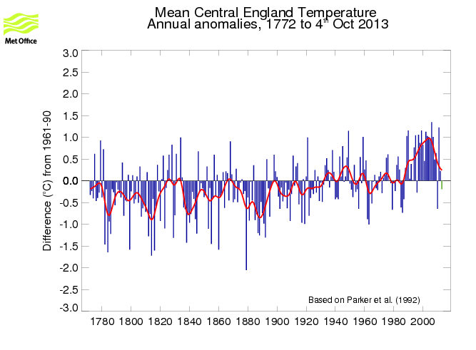
...here is CET to 1772. Temperatures have been dropping sharply for a decade. We are back to the climate of the 1730′s.
http://www.metoffice.gov.uk/hadobs/hadcet/
tonyb

Here's the chart to which Tony linked:


No, Tony Brown, Central England is not back to the climate of the 1730s


Tony has a case of confirmation bias.  He claims that "we are back to the climate of the 1730s".  To see if he's correct, we'll have to go to the longer record than the one to which he linked, which doesn't go back that far.  Let's first look at the long term decadal record for HadCET, which is better than annual temperature anomalies when considering climate change.  The trend becomes obvious:

Data Source: HadCET

The 1730s decade is the teeny orange bit wedged between all the blue columns at the left of the chart above. Now to look in closer, here are the temperature anomalies from 2001 to 2012 and the temperature anomalies from 1731 to 1742 - the anomaly is from the twentieth century average:


Year Anomaly Year Anomaly
1731
0.35
2001
0.43
1732
0.19
2002
1.10
1733
0.97
2003
1.00
1734
0.30
2004
0.98
1735
0.04
2005
0.94
1736
0.80
2006
1.32
1737
0.42
2007
0.98
1738
0.31
2008
0.46
1739
-0.30
2009
0.61
1740
-2.66
2010
-0.67
1741
-0.20
2011
1.20
1742
-1.14
2012
0.20
Average
-0.08
Average
0.71


Some years in the 1730s were quite warm compared to the century as a whole.  But the climate back then was nothing like what it's been like lately, as indicated by surface temperature.  Since 2001, the average temperature for central England was 0.71 degrees above the twentieth century average while the twelve year period since 1731 was 0.08 degrees below the twentieth century average.  The two periods are hardly comparable.


Have temperatures been "dropping sharply"?


Tony Brown writes that "Temperatures have been dropping sharply for a decade."  Let's see:

Data Source: HadCET
The above chart shows that 2010 was a cold year in Central England.  That year also happened to be the hottest year on record globally, equal to 2005.  On the other hand, the following year, 2011, was the second hottest year ever  in the 350 year record of central England temperatures, after 2006!

Here are the two periods compared in an animated chart, with the temperature scale held constant for easy comparison:

Data Source: HadCET

The only similarity I can see is that both periods can be measured as anomalies from the twentieth century mean in degree Celsius!  
Here is an animation of more periods for central England.  Look particularly at the first part of last century, to 1969, compared to the time since 1970:

Data Source: HadCET

Who is Tony Brown trying to kid?  I don't know if he really thinks the world is about to enter another ice age or not, but if he does he's deluded.  

Data Source: SkepticalScience.com

In regard to what will happen in central England, that's another matter.  At the macro level, here are the IPCC AR5 projections for temperature change under two emissions scenarios from the Summary for Policy Makers, page SPM-34 (click for larger version):

Source: IPCC AR5 WG1 page SPM-34

If the above is anything to go by, then England will get warmer if we keep burning fossil fuels.  Maybe not as much as some areas but more than others.  If we were to cut emissions and follow the RCP2.6 emissions pathway then temperatures in England might change very little from those of the period 1986-2005.  However the opportunity to do that is fading fast.

Saturday, October 5, 2013

Denier weirdness: Bob Tisdale redefines "hot" at WUWT

Sou | 5:14 PM Go to the first of 3 comments. Add a comment

When does warmer than the trend mean "especially hot"?


Is it "at the time?" - Dana Nuccitelli on 1990:
At the time, 1990 was an especially hot year. 

Is it when it lies above the trend? - Tamino on 1990:


Or is it "only if it's El Nino"? - Bob Tisdale on 1990:
1990 was an ENSO-neutral year, according to NOAA’s Oceanic NINO Index. Therefore, “1990 was…” NOT “…an especially hot year”. It was simply warmer than previous years because surface temperatures were warming then.
Data Source: NASA and WUWT!


Perennially Puzzled ENSO Bob added the above as a postscript because he can't admit he was wrong. He makes other big gaffes in his article, as usual, and not just saying that "all the models are wrong" despite observations lying within the range of the models.  Eg writing that Dana is talking about a different chart to the one he was actually discussing.

Wednesday, October 2, 2013

Steve McIntyre and Anthony Watts fail climate modeling 101

Sou | 2:51 AM Go to the first of 15 comments. Add a comment

Anthony Watts and Steve McIntyre show once again that they aren't much chop when it comes to modeling trends or lining up charts.  People might recall how poor old Steve failed dismally when he made a faltering start to psych stats (with Lewandowsky et al) and gave up before getting to first base.  He failed again when he got stuck in core tops with Marcott et al.

Now they fail by pulling up a flawed chart from an early draft of AR5 and complain it's been corrected and revised (archives here for WUWT - updated here; and The Auditor's blog).  Actually, they don't acknowledge that it's been corrected.  Neither of them want to admit there is a flaw in the draft version, which everyone else saw at the outset.  If they had they wouldn't have had an article to write.

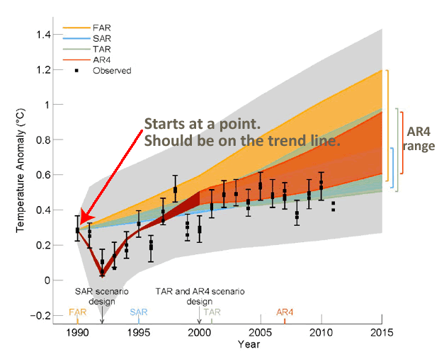
The problem was with this chart:


Tamino picked this up very early in the piece when someone called David Whitehouse tried to use it.  Ross McKitrick tried it on again recently.

I guess Steve McIntyre and Anthony Watts aren't very good at charts or models.  But if you look at this HadCRUT chart it's pretty easy to see what the problem is:

Data Source: HadCRUT

The 1990 data point is way above the trend line.  Models shouldn't be aligned with that data point, they should be aligned with the trend line.   Dana at SkepticalScience.com explains this too.

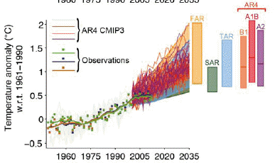
It looks as if the chart that was selected to replace the flawed chart is the one below.  It stretches over a longer time period, up to 2035 instead of 2015.  The notation says "the values are harmonised to start from the same value at 1990".  The key word, presumably, being "harmonised".  So it looks to me that it's Anthony Watts and Steve McIntyre who have it all wrong.


Source: IPCC AR5 Technical Report TFE.3, Figure 1: page TS-96 

Funny thing is it's even pointed out in the thread at Steve McIntyre's blog (archived here), but instead of acknowledging that there was an error in the first version, the commenters get into a raging argument complaining that the "expert reviewers" weren't advised of the correction and revision.  The denialiti aren't doing too well in their attempts to prove all the models and all the IPCC report is "wrong" so I guess they'll have to be satisfied complaining they weren't asked permission to make a correction to the report!

The description of the above chart is long and dense (and has a typo).  It's described as follows:
Estimated changes in the observed globally and annually averaged surface temperature anomaly relative to 1961-1990 (in °C) since 1950 compared with the range of projections from the previous IPCC assessments. Values are harmonized to start form (sic) the same value at 1990. Observed global annual temperature anomaly, relative to 1961–1990, from three datasets is shown as squares (NASA (dark blue), NOAA (warm mustard), and the UK Hadley Centre (bright green) data sets. The coloured shading shows the projected range of global annual mean near surface temperature change from 1990 to 2035 for models used in FAR (Figure 6.11), SAR (Figure 19 in the TS of IPCC 1996), TAR (full range of TAR, Figure 9.13(b)). TAR results are based on the simple climate model analyses presented in this assessment and not on the individual full three-dimensional climate model simulations. For the AR4 results are presented as single model runs of the CMIP3 ensemble for the historical period from 1950-2000 (light grey lines) and for three scenarios (A2, A1B and B1) from 2001-2035. For the three SRES scenarios the bars show the CMIP3 ensemble mean and the likely range given by -40 % to +60% of the mean as assessed in Meehl et al. (2007). The publication years of the assessment reports are shown.

This one's interesting too.  It shows the CMIP5 model runs with observations:

SourceIPCC AR5 Technical Report TFE.3, Figure 1: page TS-96 
Projections of annual mean global mean surface air temperature (GMST) for 1950–2035 (anomalies relative to 1961–1990) under different RCPs from CMIP5 models (light grey and coloured lines, one ensemble member per model), and observational estimates the same as the middle left panel. The grey shaded region shows the indicative likely range for annual mean GMST during the period 2016–2035 for all RCPs (see Figure TS.14 for more details). The grey bar shows this same indicative likely range for the year 2035.


From the WUWT comments


RC Saumarez says:
October 1, 2013 at 8:47 am
The IPCC has throen the gppd name of science into disrepute. (sic)
Are they so stupid that they think that nobody would notice or are they so sure of themselves that they are certain that they will get away with this?

KR picks up on the incorrect alignment in the early draft and also picks up Steve McIntyre and says:
October 1, 2013 at 8:34 am
The draft Figure 1.4 appears to have been incorrectly baselined – set to the 1990 peak rather than the actual trend at that time.
However, the actual caption for the draft figure (as per the leaked document) states: “The 90% uncertainty estimate due to observational uncertainty and 16 internal variability based on the HadCRUT4 temperature data for 1951-1980 is depicted by the grey shading.” In other words, the grey area shows the range of variability around model projection means, which are shown by the colored bands. Observations fall well within the range of projections – something McIntyre somehow… failed to mention.


Alistair Ahs sort of spots the error in the draft version and says (excerpt):
October 1, 2013 at 8:49 am
Look at 1990 in the second graph. In the first graph all the projections start from the 1990 observed value. In the second graph the projections start from below the 1990 observed value, because they are correctly plotted as anomalies with respect to the 1961-1990 mean.

WUWT playground monitor, richardscourtney isn't letting the IPCC get away with correcting a mistake in an early draft and says:
October 1, 2013 at 9:10 am
Alistair Ahs: ... I am curious to know if you really are called Alistair Ahs because I find it hard to believe anybody would put their own name to so stupid and pathetic an excuse as you have written. Anomalies can be normalised to any reference value. The correct reference value for a projection is from the empirically observed value at the time of the start of the projection.
Richard

Dave puts far too much faith in the incompetent Steve McIntyre and says:
October 1, 2013 at 8:29 am
Never mess with McIntyre. He will tear this thing apart line by line.
The IPCC doesn’t have a chance.

The WUWT-ers' comments get worse and worse (updated archive here).  Most of the commenters are innumerate.

From The Auditor's comments 


Wow, Judith Curry is living down to her reputation.  She's even made a "brilliant post" comment to The Auditor's silly article.  (Something we're used to on WUWT when the readers don't have a clue what an article is all about but feel the urge to write something!)

curryja Posted Oct 1, 2013 at 6:03 AM | Permalink | Reply
Steve, brilliant post by the way

Sunday, April 21, 2013

Tisdale's Tricks

Sou | 1:13 PM Go to the first of 9 comments. Add a comment

Global Surface Temperature Changes - Model and Actual

See update below.

Bob Tisdale has an article on WUWT about CMIP5 model outputs for RCP 6.0 for the period 1880 to present.  He puts up this chart:


Looks not bad, doesn't it.  The models have picked up Pinatubo very well.  While they appear to be less closely aligned to earlier periods that is where there is greater uncertainty in the record.  They are pretty close from the mid-twentieth century onwards.   Pity the chart as he shows it has no probability ranges.  (Incidentally, I have no idea of whether the chart is an accurate representation of actual temperature or the CMIP5 model outputs. No reason to doubt it but I haven't checked.)

Choosing the trend

Anyway, Bob decides to see if he can find a way to make it look bad.  So what he does is draw some different coloured 'trend' lines on different sections, one blue line and one red line.  He doesn't seem to bother with proper trend analysis or anything fancy.  All he does is divide the chart into his own segments (eyeballing only based on his comments).  Note how his dividing lines are at peaks and troughs in the record. That pretty well ensures a greater slope for the record than the model output.  He picks start and end points for short sections such that the trend lines for actual and modelled have somewhat different slopes.  That means (he thinks) he can say "aha" and "gotcha".  He seems to be arguing that there should be a perfect alignment at every point on the chart in segments of his choosing.

While some WUWT readers will grab onto the 'gotcha', they'll be the ones who think any article on WUWT (no matter what it is about) means "all the science is wrong".

I think many casual readers of WUWT will be surprised at how close the model output is to the actual record of surface temperature change.

There's a recent article on RealClimate.org discussing models and regional trends - more difficult to model than global trends.  Worth a read.

Post Script:

This post was meant to be just a dig at Bob's fiddling with 'trends'.  But it's probably worth a caution. If you manage to get towards the end of Bob's post you'll read nonsense like this:
Atrocious, horrible and horrendous are words that could be used to describe the performance of the CMIP5-archived climate models during the early warming period of 1917 to 1944. See Figure 7. According to the models, if greenhouse gases were responsible for global warming, global surface temperatures should only have warmed at a rate of about +0.049 deg C/decade. BUT according to the new and improved GISS Land-Ocean Temperature Index (LOTI) data, global surface temperatures warmed at a rate that was approximately 3.4 times faster or about 0.166 deg C/decade.
This shows a couple of things.  Firstly, that Bob views surface temperature records as being very 'correct' in the early part of this century, ignoring the larger error bars on the actual data (he doesn't show any), as illustrated below from NASA (green bars):


Secondly, despite blogging about climate for quite some years, Bob hasn't learnt what climate studies show.  He seems to think that greenhouse gases are said to have been the only forcing since industrialisation.  That's not what scientists have found.  In fact, science suggests that earlier last century, although greenhouse gas increases contributed to some extent, other forces dominated.  Here is a chart indicating likely 'natural' and anthropogenic contributions - from SkepticalScience (click image for larger version).  Read more here.


Thirdly, Bob is more hung up on short term 'trends' than on the long term rise in temperature.  He fails to see the forest, being distracted by the leaves on individual trees as they flutter slightly in the breeze. (I even wonder if in Bob's world, he replaces the anomaly with the trend so to speak.  One could speculate that even if surface temperature went up 4 degrees it wouldn't worry Bob. He'd be happy as long as he could compare short term slopes along the way (probably putting the huge rise in temperature down to a magical ENSO "jump").  For example, later on and despite the CMIP5 model being closely aligned with the observed data, Bob still reckons something is wrong because he thinks the 'slope' isn't right. I don't know what he thinks the models are based on (it's physics).)

Finally, what does he mean by "according to the models...should only have warmed..."?  He's looking right at the model output and that's not what they indicate at all.  If anything CMIP5 models indicate there 'should' have been slightly more warming, not less, than was observed in the early part of last century!

So go look at Bob's charts and maps if you want to, but ignore what Bob writes.  He's talking through his hat.

Update

Bob is still complaining for no reason.  He's done another post of the difference between the annual surface temperature anomalies and the CMIP5 model outputs.  His chart shows that for most of the 130 year period, the model was within +/- 0.1 degree Celsisus of the observed annual anomaly.  It deviates as much as +/- 0.2 degrees in the earliest records (before 1930) and in the most recent year.  In my view, that's a remarkably close alignment.  To put this into context, from one year to the next, the observed anomaly can fluctuate by more than 0.2 degrees Celsius!  The models just keep getting better.

The weird thing is that while WUWT-ers will say that the rise of 0.8 degrees Celsius is "nothing to worry about", they will be quick to say that a deviation of model output of less than 0.1 degree Celsius is "shocking".  They are too easily "shocked" and yet not "shocked" enough (about climate change).  (And I guess DB Stealey/Smokey won't be singing his usual song this time.  He won't be asking Bob to show the difference in actual temperature (not anomalies) in degrees Kelvin with the vertical axis from zero.)

Have a read of this for another take on Bob's misrepresentation.  Scroll down to the bottom to get a better view of how close the models are to reality these days.