Anthony Watts and Steve McIntyre show once again that they aren't much chop when it comes to modeling trends or lining up charts. People might recall how poor old Steve failed dismally when he made a faltering start to psych stats (with Lewandowsky et al) and gave up before getting to first base. He failed again when he got stuck in core tops with Marcott et al.
Now they fail by pulling up a flawed chart from an early draft of AR5 and complain it's been corrected and revised (archives here for WUWT - updated here; and The Auditor's blog). Actually, they don't acknowledge that it's been corrected. Neither of them want to admit there is a flaw in the draft version, which everyone else saw at the outset. If they had they wouldn't have had an article to write.
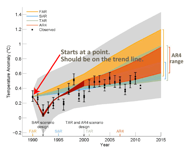
The problem was with this chart:
Tamino picked this up very early in the piece when someone called David Whitehouse tried to use it. Ross McKitrick tried it on again recently.
I guess Steve McIntyre and Anthony Watts aren't very good at charts or models. But if you look at this HadCRUT chart it's pretty easy to see what the problem is:
 |
| Data Source: HadCRUT |
The 1990 data point is way above the trend line. Models shouldn't be aligned with that data point, they should be aligned with the trend line. Dana at SkepticalScience.com explains this too.
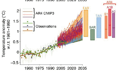
It looks as if the chart that was selected to replace the flawed chart is the one below. It stretches over a longer time period, up to 2035 instead of 2015. The notation says "the values are harmonised to start from the same value at 1990". The key word, presumably, being "harmonised". So it looks to me that it's Anthony Watts and Steve McIntyre who have it all wrong.
 |
| Source: IPCC AR5 Technical Report TFE.3, Figure 1: page TS-96 |
Funny thing is it's even pointed out in the thread at Steve McIntyre's blog (archived here), but instead of acknowledging that there was an error in the first version, the commenters get into a raging argument complaining that the "expert reviewers" weren't advised of the correction and revision. The denialiti aren't doing too well in their attempts to prove all the models and all the IPCC report is "wrong" so I guess they'll have to be satisfied complaining they weren't asked permission to make a correction to the report!
The description of the above chart is long and dense (and has a typo). It's described as follows:
Estimated changes in the observed globally and annually averaged surface temperature anomaly relative to 1961-1990 (in °C) since 1950 compared with the range of projections from the previous IPCC assessments. Values are harmonized to start form (sic) the same value at 1990. Observed global annual temperature anomaly, relative to 1961–1990, from three datasets is shown as squares (NASA (dark blue), NOAA (warm mustard), and the UK Hadley Centre (bright green) data sets. The coloured shading shows the projected range of global annual mean near surface temperature change from 1990 to 2035 for models used in FAR (Figure 6.11), SAR (Figure 19 in the TS of IPCC 1996), TAR (full range of TAR, Figure 9.13(b)). TAR results are based on the simple climate model analyses presented in this assessment and not on the individual full three-dimensional climate model simulations. For the AR4 results are presented as single model runs of the CMIP3 ensemble for the historical period from 1950-2000 (light grey lines) and for three scenarios (A2, A1B and B1) from 2001-2035. For the three SRES scenarios the bars show the CMIP3 ensemble mean and the likely range given by -40 % to +60% of the mean as assessed in Meehl et al. (2007). The publication years of the assessment reports are shown.
This one's interesting too. It shows the CMIP5 model runs with observations:
 |
| Source: IPCC AR5 Technical Report TFE.3, Figure 1: page TS-96 |
Projections of annual mean global mean surface air temperature (GMST) for 1950–2035 (anomalies relative to 1961–1990) under different RCPs from CMIP5 models (light grey and coloured lines, one ensemble member per model), and observational estimates the same as the middle left panel. The grey shaded region shows the indicative likely range for annual mean GMST during the period 2016–2035 for all RCPs (see Figure TS.14 for more details). The grey bar shows this same indicative likely range for the year 2035.
From the WUWT comments
RC Saumarez says:
October 1, 2013 at 8:47 am
The IPCC has throen the gppd name of science into disrepute. (sic)
Are they so stupid that they think that nobody would notice or are they so sure of themselves that they are certain that they will get away with this?
KR picks up on the incorrect alignment in the early draft and also picks up Steve McIntyre and says:
October 1, 2013 at 8:34 am
The draft Figure 1.4 appears to have been incorrectly baselined – set to the 1990 peak rather than the actual trend at that time.
However, the actual caption for the draft figure (as per the leaked document) states: “The 90% uncertainty estimate due to observational uncertainty and 16 internal variability based on the HadCRUT4 temperature data for 1951-1980 is depicted by the grey shading.” In other words, the grey area shows the range of variability around model projection means, which are shown by the colored bands. Observations fall well within the range of projections – something McIntyre somehow… failed to mention.
Alistair Ahs sort of spots the error in the draft version and says (excerpt):
October 1, 2013 at 8:49 am
Look at 1990 in the second graph. In the first graph all the projections start from the 1990 observed value. In the second graph the projections start from below the 1990 observed value, because they are correctly plotted as anomalies with respect to the 1961-1990 mean.
WUWT playground monitor, richardscourtney isn't letting the IPCC get away with correcting a mistake in an early draft and says:
October 1, 2013 at 9:10 am
Alistair Ahs: ... I am curious to know if you really are called Alistair Ahs because I find it hard to believe anybody would put their own name to so stupid and pathetic an excuse as you have written. Anomalies can be normalised to any reference value. The correct reference value for a projection is from the empirically observed value at the time of the start of the projection.
Richard
Dave puts far too much faith in the incompetent Steve McIntyre and says:
October 1, 2013 at 8:29 am
Never mess with McIntyre. He will tear this thing apart line by line.
The IPCC doesn’t have a chance.
The WUWT-ers' comments get worse and worse (updated archive here). Most of the commenters are innumerate.
From The Auditor's comments
Wow, Judith Curry is living down to her reputation. She's even made a "brilliant post" comment to The Auditor's silly article. (Something we're used to on WUWT when the readers don't have a clue what an article is all about but feel the urge to write something!)
curryja Posted Oct 1, 2013 at 6:03 AM | Permalink | Reply
Steve, brilliant post by the way
... as predicted: wottsupwiththatblog.wordpress.com
ReplyDeleteVery good! That crowd are so predictable, but I wouldn't have picked that one:)
DeleteWhen you score a ToldYouSo, flaunt it! It's what separates us from the beasts.
DeleteYes, as Karsten has pointed out, this is not really a great surprise. There was always likely to be some attempt/claim that they had doctored a figure to make it seem better than it actually is. I really should stop being surprised by anything anymore.
ReplyDeleteKR
ReplyDeleteIt's always appalling when people (as an example in that thread, Richard Courtney) appear unaware of the fact that a statistical trend line includes both a slope and an offset.
The major point I raised on WU, however, was that McIntyre (labeled as the author of that opening post) is ignoring the expected natural variations around the model means, the grey area on the initial figure - which shows that observations are well within projections, even with the baseline issue.
An even more clear example of this can be seen in a recent Forbes post by Patrick Michaels, where he removes the original captioning and claims that "The very large grey zone is irrelevant to the forecasts that were made." It's difficult to see that as anything but deliberate deception.
On some rare days there can be an interesting discussion at climateaudit. Alas, today was not one of those days. I tried. I tried.
ReplyDeleteI don't know if Alistair Ahs is a real name but I do know richardscourtney should be spelled Rev Richard S Courtney NotPhD. Still, he can be relied upon to be both nasty and wrong, a winning combination in any argument :)
ReplyDeleteKR
ReplyDeleteIt looks as if I've attracted the loving attention of dbstealey (aka Smokey, aka dbs, aka D. Boehm, WUWT moderator) and Willis Eschenbach as well. I've clearly upset them.
It's why I rarely post there anymore, even when blatant errors are made - I simply don't have a big enough shovel for the **** responses...
Keep up the great work Sou. Your humor in the face of such idiocy and mendacity from the deniers is admirable.
ReplyDeleteAlbatross
The Wu-WiTs that flock around WAW never cease underwhelm, but one has to wonder what lack of self awareness would lead them to demonstrate this level of cluelessness and not flinch from the embarrassing truth of their egregious errors.
ReplyDeleteThey simply have no shame.
Bernard J.
Their subjective truth does not include any error on their part, nor on the part of those they regard as fellows. Objective evidence has no interaction with such truths.
DeleteWhat I notice is that there's nothing new emerging. Tricks like the FoI tactic and SlimeItGate have been used and countered. Taking scientists to court is back-firing. Denial is becoming associated with seriously un-cool people.
This should be a great time for deniers - no spectaculars this year and the Arctic ice thing - and yet they appear tired, whinging and repetitive. And old. If we weren't looking, would we even notice them?
Very few people are noticing them at the moment. The deniers are "noticing" each other and passing one silly complaint from one blog to the next, even after it's pointed out they are wrong.
DeleteThere are some outlets for deniers - the usual Fox News and Daily Fail and The Australian. Even in those places there is starting to be some real science discussed without deniers intruding.
Thanks from me too, Sou; I look in here most days for your articles and the fine comments. There's no better vantage from which to watch the denier crew start gnawing on their own livers.
ReplyDeleteCurry is heading for crackup, I reckon. From a little social use of denial a few years ago to a state where deniers are her whole social circle, including some hardcore types - I've never seen a clearer case for an intervention. It's too late now, I fear. The Brian Josephson story all over again, this time as farce.
I'm tempted to make up a study showing that 97% of people reading AR5 believe it's wrong and are searching for why. For normal people the WOW factor ran out with the second one.
Great work Sou!
ReplyDeleteMcIntyre also makes the point that Figure 10.26 from AR4 also uses the same baseline and then updates this figure with the latest observations. So, perhaps we have found another error in AR4, strange how its only pointed out when it yields inconvenient results?? Perhaps the AR4 authors actually reproduced the initial intent of the AR4 simulations and it was not an error after all.
ReplyDelete