.
Showing posts with label the Auditor. Show all posts

Tuesday, November 19, 2013

Science deniers use a flawed discarded IPCC chart, but accept Cowtan and Way (for the most part)

Sou | 2:43 PM Go to the first of 5 comments. Add a comment

Science deniers have resorted to once again using a flawed discarded chart from an earlier draft of the AR5 IPCC report.  This time to consider the new paper by Cowtan and Way, which I've already written about here.

The denialati didn't have to use a flawed, discarded chart.  Though it's kind of cute that they've finally found something produced by the IPCC which they like.  Most of the time science deniers reject everything from the IPCC but when it comes to something the IPCC has rejected, they suddenly decide they'll embrace it.

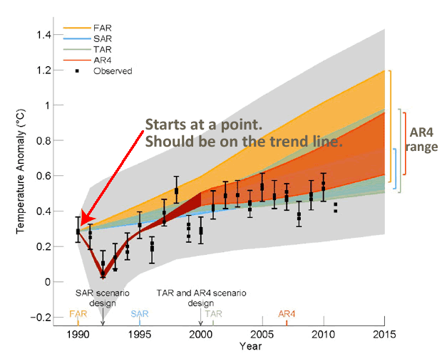
Which discarded IPCC chart do science deniers hang onto so tenaciously? No, it's not the discarded chart showing short term projections (to 2015) for "Estimated changes in the observed globally and annually averaged surface temperature (in °C) since 1990 compared with the range of projections from the previous IPCC assessments".  It's the discarded IPCC chart showing short term projections (to 2015) for which "the focus is now on the range of selected scenario projections from AR4".

Not only do the deniers want to use a discarded chart, they want to use a discarded chart that uses older AR4 CMIP3 models (see below), not the discarded chart using CMIP5 models used by AR5.

One thing though, it looks as if some of the deniers have accepted some actual climate science.  Anthony Watts and Stephen McIntyre seem to have accepted Cowtan and Way.


Deniers refuse to see the envelope


It not all roses though.  Some of the science deniers reject what their chosen discarded chart purports to represent.  (I hope you're still able to follow the denier trail heading down their convoluted topsy turvey denier pathway.)The chart itself has grey shading (see below) that depicts the "90% uncertainty estimate due to observational uncertainty and internal variability based on the HadCRUT4 temperature data for 1951-1980".

Anthony Watts, probably because it's beyond him, writes a headline: simply copies and pastes a teeny bit from The Auditor's blog (CA archived here), writing (WUWT archived here):
In the context of IPCC SOD FIgure 1.5 (or similar comparison of models and observations), CW13 is slightly warmer than HadCRUT4 but the difference is small relative to the discrepancy between models and observations; the CW13 variation is also outside the Figure 1.5 envelope.
Well, first of all the fake sceptics are using a flawed chart to misrepresent the data.  Secondly, it's not "outside" the 90% envelope even on the flawed chart.

Oh boy! They really are a sad desperate bunch of scallywags, aren't they.

Just so you can see why science deniers use a rejected and flawed chart, this is the chart rejected by the IPCC but which the Auditor chose to depict:


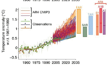
Below is the closest chart in the final AR5 draft of the IPCC WG1 report, showing AR4 and CMIP3 projections out to a more realistic 2035.  Observations are within the range depicted by the models:

Source: IPCC AR5 TFE.3 Figure 1 page TS-96

And here, for comparison are temperature projections using the latest AR5 CMIP5 projections:

Source: IPCC AR5 TFE.3 Figure 1 page TS-96

Science denier's cannot help themselves...


I went to The Auditor's blog and read this (archived here):
That there are continuing defects in HadCRU methodology should hardly come as a surprise to CA readers. 
It reads like a denier interpretation, emphasising the words "continuing defects".  It's true that HadCRUT still doesn't provide for the Arctic properly.  Cowtan and Way call it a "bias" in their abstract. It's acknowledged by scientists that HadCRUT is biased because of the way HadCRUT is constructed.  Because of the gaps in the coverage particularly in the Arctic.  The fact that Cowtan and Way used a hybrid of different temperature sources shows that their method is not straightforward and I don't expect it would be easy to incorporate all the measures they used into a monthly update of HadCRUT.  Hopefully a reader will shed more light on that.

The Auditor then wrote this, which Anthony Watts omitted:
Attempts to reconcile and/or explain discrepancies between HadCRU and GISS also seem worthwhile to me.
I would not accept any praise coming from The Auditor.  It's not worth a brass razoo.  I'd only accept praise from scientists who specialise in studying the global surface temperature anomaly.  And there's plenty of praise to go around for Cowtan and Way from scientific sources without having to take any notice of the denialati.


Filling gaps in global surface temperature coverage


In any case, Cowtan and Way didn't do the work to reconcile or explain discrepancies between HadCRUT and GISTemp.  The reason they did the work was to fill in the gaps in global surface temperature coverage.  The results are what they are.

Here again is the video explaining the research and showing where the gaps are, the before and after Cowtan and Way:


The following is an excerpt from an article co-authored by Kevin Cowtan, Robert Way and Dana Nuccitelli at SkepticalScience.com (my bold italics):
The study, authored by Kevin Cowtan from the University of York and Robert Way from the University of Ottawa (who both also contribute to Skeptical Science), notes that the Met Office data set only covers about 84 percent of the Earth's surface. There are large gaps in its coverage, mainly in the Arctic, Antarctica, and Africa, where temperature monitoring stations are relatively scarce. ...
...Dr. Cowtan is an interdisciplinary computational scientist who recognized some potential solutions to this temperature coverage gap problem.
"Like many scientists, I'm an obsessive problem solver. Sometimes you see a problem and think 'That's mine, I can make a contribution here'"

The article goes on to describe how Cowtan and Way filled the gaps in coverage:
In their paper, Cowtan & Way apply a kriging approach to fill in the gaps between surface measurements, but they do so for both land and oceans. In a second approach, they also take advantage of the near-global coverage of satellite observations, combining the University of Alabama at Huntsville (UAH) satellite temperature measurements with the available surface data to fill in the gaps with a 'hybrid' temperature data set. They found that the kriging method works best to estimate temperatures over the oceans, while the hybrid method works best over land and most importantly sea ice, which accounts for much of the unobserved region.
Both of their new surface temperature data sets show significantly more warming over the past 16 years than HadCRUT4. This is mainly due to HadCRUT4 missing accelerated Arctic warming, especially since 1997.

It's been warming!


And the result was that the rate of increase in surface temperature between 1997 and 2012 turns out to be greater than that depicted by both HadCRUT4 and GISTemp.
Cowtan & Way investigate the claim of a global surface warming 'pause' over the past 16 years by examining the trends from 1997 through 2012. While HadCRUT4 only estimates the surface warming trend at 0.046°C per decade during that time, and NASA puts it at 0.080°C per decade, the new kriging and hybrid data sets estimate the trend during this time at 0.11 and 0.12°C per decade, respectively.

From the WUWT comments

Below are a few of the comments from Anthony Watts WUWT article (archived here).  Although Stephen McIntyre seems to accept the findings, most of Anthony Watts' WUWT rabble can't bring themselves to do so.

R Taylor gets what is "supposed to be" backwards.  I guess R Taylor hasn't heard of Arctic amplification and says:
November 18, 2013 at 2:15 pm
Pity the polar data, tortured into an inadequate confession. After all, greenhouse theory says the tropical troposphere is supposed to warm first and fastest.

catweazle666 is plain weird and thinks that if the surface heats up it must mean the oceans don't, and says:
November 18, 2013 at 2:30 pm
What happened to all the heat that was hiding deep in the oceans?
How did it suddenly migrate to the Arctic – retrospectively too, apparently.
Clearly this is groundbreaking new scientific theory!

prjindigo cannot cope with any new scientific findings and decides that knowledge is a "fake religion" and says:
November 18, 2013 at 2:36 pm
So one man’s BS doesn’t match another’s? Its starting to look like the data sets are all fake religions.

Ugh! Tedious Bob Tisdale promises another lengthy impenetrable boring cut and paste from his endless wrong diatribes and says:
November 18, 2013 at 3:00 pm
Darn, Steve M beat me to the apparent 2005 breakpoint in the difference between the HADCRUT and Cowart and Ray (2013) data. My versions are here:
http://bobtisdale.files.wordpress.com/2013/11/figure-44.png
My post will hopefully be finished tomorrow and I’ll explain why that’s odd…among other things the warmistas have overlooked.

ROM says he's gone and made a fool of himself at Lucia's blog, apparently not realising that the Cowtan and Way analysis is from 1979 to 2012.  Nor does he understand that the purpose of the study was not to come to a predefined outcome.  It was done to fill in the gaps in the coverage.  The findings were what they were.  You'll see that ROM equates discovering new knowledge with being raped.  What a nutter!
November 18, 2013 at 3:12 pm
I have just posted this on Lucia’s “The Blackboard”
As a humble member of the public who is expected to pay for most of this climate science research guff and who as a member of that low life uninformed public who are expected to lay down and be data raped by every passing wannabe climate scientist, it seems to me that the finangling [ I could use some quite unprintable language to describe this ] of the data where no data exists to get a result that ensures that what is seen to be happening in the climate, isn’t according to the non existent data.
In this case attempting to dispel the idea that there is a “Pause” in the warming using some fancy and argued about statistical techniques applied to that non existent data taken from a region where there are almost no records to justify the claim there isn’t a Pause of over 16 years running in the climb in global temperatures.
So why is it that this particular statistical lash-up couldn’t also be applied to those 20 years of supposed increasing temperatures from 1978 to 2007, a period which is only 4 years longer than the Pause and on which 20 years the entire global warming meme / ideology is based.
Using Cowtan & Way’s statistical techniques and the same identical data base of temperatures it could probably be proven that there was no increase in global temperatures during that 20 years of supposed warming.

milodonharlani is a purist denier.  He doesn't "believe" the science (excerpt):
November 18, 2013 at 5:53 pm
The models aren’t based upon either physics or observations. They’re based upon GIGO assumptions not in evidence, indeed contrary to all actual observations & physical evidence.

Dumb Scientist does a terrific job of informing the denialati and responding to their questions at WUWT, copping a fair bit of flak in the process (archived here).


Kevin Cowtan and Robert G. Way (2013), Coverage bias in the HadCRUT4 temperature series and its impact on recent temperature trends, Quarterly Journal of the Royal Meteorological Society, http://dx.doi.org/10.1002/qj.2297

Wednesday, October 2, 2013

Steve McIntyre and Anthony Watts fail climate modeling 101

Sou | 2:51 AM Go to the first of 15 comments. Add a comment

Anthony Watts and Steve McIntyre show once again that they aren't much chop when it comes to modeling trends or lining up charts.  People might recall how poor old Steve failed dismally when he made a faltering start to psych stats (with Lewandowsky et al) and gave up before getting to first base.  He failed again when he got stuck in core tops with Marcott et al.

Now they fail by pulling up a flawed chart from an early draft of AR5 and complain it's been corrected and revised (archives here for WUWT - updated here; and The Auditor's blog).  Actually, they don't acknowledge that it's been corrected.  Neither of them want to admit there is a flaw in the draft version, which everyone else saw at the outset.  If they had they wouldn't have had an article to write.

The problem was with this chart:


Tamino picked this up very early in the piece when someone called David Whitehouse tried to use it.  Ross McKitrick tried it on again recently.

I guess Steve McIntyre and Anthony Watts aren't very good at charts or models.  But if you look at this HadCRUT chart it's pretty easy to see what the problem is:

Data Source: HadCRUT

The 1990 data point is way above the trend line.  Models shouldn't be aligned with that data point, they should be aligned with the trend line.   Dana at SkepticalScience.com explains this too.

It looks as if the chart that was selected to replace the flawed chart is the one below.  It stretches over a longer time period, up to 2035 instead of 2015.  The notation says "the values are harmonised to start from the same value at 1990".  The key word, presumably, being "harmonised".  So it looks to me that it's Anthony Watts and Steve McIntyre who have it all wrong.


Source: IPCC AR5 Technical Report TFE.3, Figure 1: page TS-96 

Funny thing is it's even pointed out in the thread at Steve McIntyre's blog (archived here), but instead of acknowledging that there was an error in the first version, the commenters get into a raging argument complaining that the "expert reviewers" weren't advised of the correction and revision.  The denialiti aren't doing too well in their attempts to prove all the models and all the IPCC report is "wrong" so I guess they'll have to be satisfied complaining they weren't asked permission to make a correction to the report!

The description of the above chart is long and dense (and has a typo).  It's described as follows:
Estimated changes in the observed globally and annually averaged surface temperature anomaly relative to 1961-1990 (in °C) since 1950 compared with the range of projections from the previous IPCC assessments. Values are harmonized to start form (sic) the same value at 1990. Observed global annual temperature anomaly, relative to 1961–1990, from three datasets is shown as squares (NASA (dark blue), NOAA (warm mustard), and the UK Hadley Centre (bright green) data sets. The coloured shading shows the projected range of global annual mean near surface temperature change from 1990 to 2035 for models used in FAR (Figure 6.11), SAR (Figure 19 in the TS of IPCC 1996), TAR (full range of TAR, Figure 9.13(b)). TAR results are based on the simple climate model analyses presented in this assessment and not on the individual full three-dimensional climate model simulations. For the AR4 results are presented as single model runs of the CMIP3 ensemble for the historical period from 1950-2000 (light grey lines) and for three scenarios (A2, A1B and B1) from 2001-2035. For the three SRES scenarios the bars show the CMIP3 ensemble mean and the likely range given by -40 % to +60% of the mean as assessed in Meehl et al. (2007). The publication years of the assessment reports are shown.

This one's interesting too.  It shows the CMIP5 model runs with observations:

SourceIPCC AR5 Technical Report TFE.3, Figure 1: page TS-96 
Projections of annual mean global mean surface air temperature (GMST) for 1950–2035 (anomalies relative to 1961–1990) under different RCPs from CMIP5 models (light grey and coloured lines, one ensemble member per model), and observational estimates the same as the middle left panel. The grey shaded region shows the indicative likely range for annual mean GMST during the period 2016–2035 for all RCPs (see Figure TS.14 for more details). The grey bar shows this same indicative likely range for the year 2035.


From the WUWT comments


RC Saumarez says:
October 1, 2013 at 8:47 am
The IPCC has throen the gppd name of science into disrepute. (sic)
Are they so stupid that they think that nobody would notice or are they so sure of themselves that they are certain that they will get away with this?

KR picks up on the incorrect alignment in the early draft and also picks up Steve McIntyre and says:
October 1, 2013 at 8:34 am
The draft Figure 1.4 appears to have been incorrectly baselined – set to the 1990 peak rather than the actual trend at that time.
However, the actual caption for the draft figure (as per the leaked document) states: “The 90% uncertainty estimate due to observational uncertainty and 16 internal variability based on the HadCRUT4 temperature data for 1951-1980 is depicted by the grey shading.” In other words, the grey area shows the range of variability around model projection means, which are shown by the colored bands. Observations fall well within the range of projections – something McIntyre somehow… failed to mention.


Alistair Ahs sort of spots the error in the draft version and says (excerpt):
October 1, 2013 at 8:49 am
Look at 1990 in the second graph. In the first graph all the projections start from the 1990 observed value. In the second graph the projections start from below the 1990 observed value, because they are correctly plotted as anomalies with respect to the 1961-1990 mean.

WUWT playground monitor, richardscourtney isn't letting the IPCC get away with correcting a mistake in an early draft and says:
October 1, 2013 at 9:10 am
Alistair Ahs: ... I am curious to know if you really are called Alistair Ahs because I find it hard to believe anybody would put their own name to so stupid and pathetic an excuse as you have written. Anomalies can be normalised to any reference value. The correct reference value for a projection is from the empirically observed value at the time of the start of the projection.
Richard

Dave puts far too much faith in the incompetent Steve McIntyre and says:
October 1, 2013 at 8:29 am
Never mess with McIntyre. He will tear this thing apart line by line.
The IPCC doesn’t have a chance.

The WUWT-ers' comments get worse and worse (updated archive here).  Most of the commenters are innumerate.

From The Auditor's comments 


Wow, Judith Curry is living down to her reputation.  She's even made a "brilliant post" comment to The Auditor's silly article.  (Something we're used to on WUWT when the readers don't have a clue what an article is all about but feel the urge to write something!)

curryja Posted Oct 1, 2013 at 6:03 AM | Permalink | Reply
Steve, brilliant post by the way

Monday, June 17, 2013

A very predictable pattern...

Sou | 8:10 PM Feel free to comment!

Anthony Watts of WUWT has posted a quote from a Canadian denialist called McIntyre, referring to a new paper by Briffa et al, writing in part: "unsurprisingly there is issue after issue" - but then as far as I can see, doesn't list a single one of his "issues". (McIntyre is not a climate scientist but likes to pretend.)

Watts is a real card sometimes!
Anthony seems to think it will destroy the hockey stick - ROTFL.

McIntyre does make snide comments and suggests the scientists are deceitful and incompetent - but that's par for the course with that dreadful man. He's like the town gossip who has to make up stuff to retain an audience.


I don't normally bother with the Auditor.  He's a very nasty piece of work but is a bit too weird for most people to bother with.  He's also a very good example of the Dunning Kruger Effect.


A very predictable pattern...

If anyone is interested in his latest mud-slinging attempt, referred to by Anthony Watts on WUWT, I suggest you read this 2009 article from Tim Lambert at Deltoid and substitute today's date.  Nothing's changed.  Note especially this quote from realclimate.org referring to yet another example of McIntyre's attempts to discredit science and scientists - back in 2007:
What is clear however, is that there is a very predictable pattern to the reaction to these blog posts that has been discussed many times. As we said last time there was such a kerfuffle:
However, there is clearly a latent and deeply felt wish in some sectors for the whole problem of global warming to be reduced to a statistical quirk or a mistake. This led to some truly death-defying leaping to conclusions when this issue hit the blogosphere.
Plus ça change… 
And then read this article in realclimate.org about the new paper by Briffa et al, in which is detailed some of the appalling behaviour of McIntyre.  The Briffa paper and supplementary material can be accessed here (no paywall).

No matter how many times McIntyre gets it wrong he continues to try to tear down the reputations of some of the world's best scientists.  It's like a game to him and is all part of his disinformation campaign.  Luckily no one understands him.  Unfortunately, because they don't understand him, imbeciles like Watts just make up stuff like "all the scientists are wrong and don't no nuffin'".

I'm not wasting any more space on that despicable little man.

Tuesday, April 23, 2013

PAGES-2K arrives and barely a whimper from the deniosphere

Sou | 7:48 PM Go to the first of 6 comments. Add a comment
See update below for some comments on Bob Tisdale's protest (4th WUWT article).

With paleo studies coming thick and fast the deniosphere is finding it hard to keep up.  A paper from PAGES-2k came out in Nature Geosciences only a day ago.  So far WUWT has written three four articles, but with barely a protest (except for a suggestion that Europe = the entire world - and now Tisdale's weak and silly protest below).  Nothing like the furious pace of protest articles and downright silliness that the Marcott study brought out.  I suppose there's time for that. Maybe Anthony is thinking that if he doesn't make too much fuss about scientific evidence it will all just go away and leave him to deny in peace.

Meanwhile the Auditor has bunkered down, obsessing with little details of individual proxies, ignoring the whole picture as usual.  Probably trying to figure out which of the dozens of collaborating institutions he'll pick for his next barrage of vexatious FOIs.  He can mutter in his beard all he wants, but it won't change the past or reverse global warming.

Continental temperatures of the past 2000 years

Now for people who are actually interested in regional and continental temperatures over the past 2000 years:


Study background

Some background from the FAQ: PAGES was formed in 1991 through the International Geosphere Biosphere Programme (IGBP).  It allowed teams all around the world to join forces and do research on climatic and environmental dynamics by studying the past.  In 2006, the PAGES 2k network was set up to look particularly at the last 2,000 years of data.

There were 78 people from around the world who collaborated in the study, a vast undertaking.  The result is a detailed picture of temperature changes at a regional / continental level all around the world.

From the abstract - a recent reversal of long term cooling:
The most coherent feature in nearly all of the regional temperature reconstructions is a long-term cooling trend, which ended late in the nineteenth century.
At multi-decadal to centennial scales, temperature variability shows distinctly different regional patterns, with more similarity within each hemisphere than between them. There were no globally synchronous multi-decadal warm or cold intervals that define a worldwide Medieval Warm Period or Little Ice Age, but all reconstructions show generally cold conditions between AD 1580 and 1880, punctuated in some regions by warm decades during the eighteenth century. The transition to these colder conditions occurred earlier in the Arctic, Europe and Asia than in North America or the Southern Hemisphere regions.
Recent warming reversed the long-term cooling; during the period AD 1971–2000, the area-weighted average reconstructed temperature was higher than any other time in nearly 1,400 years.


It's getting hot (and the MWP wasn't global)

The issue deniers are zoning in on is the confirmation from more and more scientific sources that periods of warming in medieval times were not synchronous around the world.  The world as a whole didn't get hotter.  Different regions warmed and cooled at different times.  The Medieval Warm Period (MWP) in northern Europe was local not global.

Even though it would be foolish in the extreme to say "the world's got warmer before therefore this time around it's not CO2" - that's precisely what some deniers used to say.  With this and other recent studies they no longer have a leg to stand on in that regard.  That doesn't stop deniers still regurgitating drivel of various different kinds, as seen by these comments from WUWT.

First there's disbelief that it's at least as hot now as at any time since civilisation and a denial that it's the atmosphere that keeps earth warm (how does he think it happens I wonder?):
E.M.Smith says:
April 23, 2013 at 12:56 am So if they show it was clearly warmer in the past, and we didn’t “tip” into a disaster, doesn’t that kind of put a hole in that whole “tipping point” idea…It also seems that they can’t quite accept that natural variation which worked in the past can continue to work today, and have to embrace a new cause (CO2) for modern temperatures. Just a tiny bit tacky…

While Tom tries to downplay the problem:
Tom Harley says:
April 23, 2013 at 1:10 am It’s still just ‘weather’.

And the appropriately name Village Idiot** gets it completely wrong, saying - b..b..b..but what about potatoes in Greenland? Isn't Greenland the whole world?  Didn't the Vikings sail to Greenland via Peru?:
April 23, 2013 at 1:17 am  Of course, it’s an established and accepted scientific fact that the MWP was a worldwide warm period; warmer than the present. We don’t need doubtful proxies, flawed studies or so called climate experts to tell us that. The Vikings grew potatoes on Greenland, for goodness sake!

This chap has his head buried deep in the sand and doesn't seem to 'believe' anything in evidence of past climates, presumably including any MWP:
RCSaumarez says:
April 22, 2013 at 3:52 pm  Who believes proxy studies?
The last sentence sums up the typical denier.  Show them the instrumental record and they'll say "who believes thermometers".  Show them proxy evidence and they'll say "who believes proxies".   Show them bits of the moon brought back by astronauts and they'll say "it's just cheese".  Well, you get the picture.

Luckily for humanity, only about  8% of people are so "dismissive".

Update 1 

(10:30 pm 23 April 2013)
Bob Tisdale, in the fourth WUWT article about the study puts up a few different figures and, after giving us his usual silly spiel about the oceans causing global warming (they don't, it's mostly our waste CO2), writes:
Now, hasn’t this been one of the arguments by climate skeptics since the hockey stick was introduced—that the hockey-stick appearance is a regional phenomenon? That regional reconstructions show current temperatures have been exceeded in the past in many parts of the globe?
Lets break this down.  Has it been 'one of the arguments of climate skeptics'?  Well, it might have been, who am I to judge.  Fake climate skeptics come up with a zillion silly 'arguments' on a daily basis.  You can see a whole list of them here on SkepticalScience.com (174 and counting).

Have regional reconstructions shown some regions have been hotter in the past?  Umm, probably.  The big worry now is that on average, the entire world is heating up.  That's why it's called "global warming".  (That doesn't mean that every place on earth is getting hotter.  It means the earth as a whole is getting hotter.)

What's happening now is not just one or two warmer regions, with other regions getting cooler and balancing out, so there isn't much change in global average temperature.  What's happening now is that the global average temperature is rising, reversing a global cooling trend.

This is what the authors say in the abstract:
Recent warming reversed the long-term cooling; during the period AD 1971–2000, the area-weighted average reconstructed temperature was higher than any other time in nearly 1,400 years.
Their study can't say more than that because it doesn't provide the data for all regions going back 2,000 years.  Other studies do that.

Anyway, look below and judge for yourself how many places are heating up.  About the only place that was much warmer for any length of time was Antarctica. The Arctic was much cooler than now.  Asia, North America, South America and Australasia show up the recent heating as a new trend.  Europe had a few warmish spells of shorter duration - maybe as hot as it is now or even for a short time, warmer. Everywhere looks poised to keep on heating up.  And nothing below negates what the paper's authors stated:  The period from 1971 to 2000 was higher than at any time going back nearly 1400 years (at least).  And bear in mind that the temperature rise has continued into the 2000s!  There's no going back now.  The best we can do is slow the heating and hopefully help future generations stop it.

Here is a chart from the supplementary information. (Click image to enlarge.)

**I call Poe.

Monday, April 1, 2013

Dismissives Still Furious with Marcott et al

MobyT | 3:53 PM Go to the first of 6 comments. Add a comment

Update: Admiration owed the Young Researchers

Good research brings out the best in good people and the worst in bad people.  I applaud Drs Marcott and Shakun and their supervisors for impeccable behaviour in the face of the vicious onslaught of lies and defamation from the usual crowd of science deniers, including some science-denying scientists.

If climate science continues to attract people having such a high calibre of research and such wonderfully strong character as Drs Marcott and Shakun, there is still hope for the world.


Marcott for Dummies is out.  However, Anthony Watts (in his seventeenth protest article) and the Auditor demonstrate that even after all this time and all their protests they still haven't even read the paper, claiming that Marcott et al "finally concede" something that was stated at the outset in the paper itself (page 1198). (Update: Not so, McIntyre knew about the research paper's caution that the little uptick was "probably not robust" from the outset, as evidenced in the comment section of his first blog article on the subject.  Showing yet again how The Auditor is nothing more than a run-of-the-mill denier liar.)

Disinformation merchants lie to the 8% Dismissives, and pretend they don't know that the comparison of the Holocene temperature history was with the modern instrumental record and has nothing to do with the 'uptick'. The Auditor and his devious cronies pull out all stops to play the denier's nasty game. (I don't know why the disinformation merchants bother to lie - it's not as if the 8% Dismissives are ever going to accept reality.)

 Missing the core

The Auditor and his brigade are not at all grateful for the extra effort made by the researchers to explain their work to the layperson, and appear to be still trying to claim we are in the middle of the Little Ice Age and focusing on core tops instead of the core!  

(Standardising the age of core tops is sensible science. The flailing Auditor can't find anything to support his unwarranted war on science so he picks this at random, safe in the knowledge that his target audience wouldn't know a core top from a speleotherm.)

Deniers apparently refuse to understand the connect between the modern record and the paleo record, even after years of nit-picking climate research.  


Greenland anyone?

And I wonder will the 8% Dismissives repent their earlier ludicrous mistake and heed this part of the FAQ:
Just as it would not be reasonable to use the recent instrumental temperature history from Greenland (for example) as being representative of the planet as a whole...

Their fury knows no bounds

The Auditor's cronies continue to make wild unfounded accusations. Conspiracy ideation most definitely (no wonder they don't like Lewandowsky and others showing them up in their true colours).

Meanwhile, Roger Pielke Jr goes one step further into the most vicious (and arguably libellous) rant.  (I won't link to his blog article.)  Pielke Jr writes a long blog article where he makes false allegations and misrepresents the findings, deliberately or otherwise confusing the (not robust) uptick in the proxy data with the instrumental record.  It looks as if he, too, must think we are still stuck in the Little Ice Age.

In my view, the astounding and disgusting reaction from deniers like Pielke Jr and others is because they cannot fault the science so they set out to misrepresent it, either deliberately or because they don't have the wit or will to digest it.  The Marcott et al paper and the supplementary material is eloquently written and easy to read.  The FAQ is perhaps even clearer so that most laypeople should understand it easily.  

The fact deniers can't fault the science means they can do nothing but misrepresent the research or flop back to their fallback position - climate science  is a hoax being perpetrated by scientists all around the world, governments of all political persuasions everywhere, the mainstream media and the informed public - and can be traced back nearly two centuries, from modern climatology back through Plass and Reveille and Broecker and Callendar and Arrhenius all the way back to Fourier and Tyndall (if not to Aristotle).


Update: Despicable Curry

Judith Curry sits herself even more firmly in the denier bandwagon with arguably libellous insinuations.  No surprises there.  Because of her past abominable behaviour she'd have no friends left in science so has nowhere else to go but down. She has the hide to talk of ethics while her own behaviour is not just unethical, it's immoral IMO. I'm disgusted.


Update: Admiration owed the Young Researchers

One thing - good research brings out the best in good people and the worst in bad people.  I applaud Drs Marcott and Shakun and their supervisors for impeccable behaviour in the face of the vicious onslaught of lies and defamation from the usual crowd of science deniers, including some science-denying scientists.

If climate science continues to attract people having such a high calibre of research and such wonderfully strong character as Drs Marcott and Shakun, there is still hope for the world.

Where to get it

The Marcott et al (2013) paper and supplementary material is available at Science and the FAQ is available on RealClimate.


Addendum

Above all the noise of denialists, there is this one small post on realclimate.org, which gives high praise to Shaun Marcott and Jeremy Shakun et al. (I took the liberty of adding a link to Wikipedia.)

  1. Susan Anderson says:
    I was venting about this to my father (PW Anderson), and he mentioned that he had read the article in Science and I could quote him, and even found the issue for me. Since he will be 90 soon and prefers to stay out of this donnybrook, this is quite a compliment, and I hope Marcott will see it!

    He said he was impressed; the article was “very clean” and “well put together”.


The above is an expanded version of my latest comment on Watts is Whopping Mad (Crazy) after Marcott et al - Must be the Heat!