.
Showing posts with label Central England Temperature. Show all posts

Friday, July 29, 2016

Another "ice age" fear for England - only at WUWT

Sou | 9:06 PM Go to the first of 30 comments. Add a comment
Anthony Watts has posted another alarmist article, this time about how England might suffer from an ice age some time soon. The guest opinion was penned by John Hardy (UK), and was posted under a painting by Abraham Hondius: “The Frozen Thames” 1677 (during the Maunder minimum) (archived here).

One of the important messages from this article is that one would be very unwise to pay any attention to anything written at WUWT. I don't know why deniers have such an aversion to learning about climate. Nor do I know why they are so shameless about showing their ignorance. Nor why they are apparently unwilling or unable to do basic fact-checking or research.

Thursday, January 7, 2016

Central England temperature - no ice age in sight

Sou | 2:50 PM Go to the first of 8 comments. Add a comment
There are a few denier bloggers who like to use the temperature record of Central England to argue that an ice age is coming, or at least to claim, contrary to all evidence, that it's cooling down. That's fallen out of favour lately, probably because the record maintained by the UK Met Office doesn't support their wishes or fears. Tamino has recently written about this record in considerable detail. I was also alerted to an exchange on Twitter started by Andrew Neil, who is with the BBC, Spectator and various other media going by his Twitter tagline. He might excel in some areas, but his research skills are not so hot when it comes to weather and climate. He tweeted:

No, Andrew, it's not correct. Given the different responses Andrew Neil got, I thought I'd put up a couple of charts so you can spread them around among the people who deny what's been happening in the middle of that small but important island in the North Atlantic. Since Andrew asked about the long term average, I've plotted it against the twentieth century mean.

Saturday, May 2, 2015

Central England Temperature has fallen out of favour at WUWT

Sou | 3:07 AM Go to the first of 5 comments. Add a comment
Some of you might remember how various WUWT-ers were hailing the temperature in Central England (HadCET) as heralding in an ice age. Two years ago a denier at WUWT was claiming that an ice age cometh, and pointed to HadCET - which, as you'll see below, indicated no such thing.  In June that year, David "funny sunny" Archibald made one of his famous failed predictions, that Central England was in for a cold spell. A few months later, a chap called Tony Brown claimed that HadCET showed temperatures were back to those of the 1730s, which was utter nonsense. (That is, they weren't!)

Now that particular temperature record has fallen out of favour. Not even the most ardent denier can deny it's got a lot hotter there in the past few years. I say they can't deny it, but they do, still.

Saturday, January 10, 2015

Neil Catto, an innumerate from WUWT, visits Central England

Sou | 5:11 AM Go to the first of 25 comments. Add a comment

The people who inhabit deniersville are strangely attracted to central England. They are fascinated by the surface temperature there. Today there's an article at WUWT by Neil Catto (archived here). Don't ask me who Neil Catto is - I haven't a clue.  His main claim to fame is that he was awarded the "dumbest article of the day" by HotWhopper in 2013 for innumeracy. He hasn't learned a thing.  Here is some of what he wrote this time around:
The CET record started in 1659 close to the minimum of the little ice age. As such, it is with no surprise that last year (2014) was the warmest on record. It would appear to be a natural recovery. The monthly mean temperature of 8.87 Deg C in 1659 has increased to 10.95 Deg C in 2014; which equates to 0.06 Deg C/decade.

Neil has a strange way of looking at things, doesn't he. The second sentence does not follow from the first. What would cause the temperature to rise after the Little Ice Age? Neil doesn't give any clues at all. He just thinks it would. All by itself. Neil believes in magic bouncing temperatures.


Wednesday, June 19, 2013

Will WUWT's David Archibald be right and severe cold hit Central England?

Sou | 3:01 PM Go to the first of 7 comments. Add a comment

Anthony Watts of WUWT infamy favours David Archibald, who makes funny sunny predictions.  This time Archibald is asking if Central England will have a sudden drop in temperature for a bit.  He bases his surmise on "wiggle matching" with the temperature drop in 1740.  The Archibald post oddly enough comes straight after a post by a physicist denier, rbgatduke, who slammed Christy and Monckton for what he saw as their abuse of statistics and charting.

Anyway, I thought I'd do some pattern matching of my own to see how well that would have worked for David Archibald in the past.  I've superimposed the bit around 1740 onto what look like the closest matches later on.  Same as David Archibald did only he just did it for the current period.

Here's the result - you'll probably have to click on the animated gif chart to see the larger version.

Source: Adapted from UK Met - Hadley Centre


So there was a dip in the late 1879, but not as great as the 1740 drop, other than that nothing.  Like David Archibald says, we'll have to wait and see.  With the jet stream the way it is, climate change and the weather in the UK being a bit weird lately, I suppose anything could happen.


There is a paper on the 1740 event written by Dr Phil Jones but I can't find a full copy.  Here is another paper by Dr Jones (2008) that touches on the subject and is a good read in its own right; and a myth-buster.


Update:


Here's an animated chart for anonymous in the comments, to put the weather in the UK during March 2013 and December 2010 into context of the whole world.  Winter still happens, it's just that when taken over the whole world, the earth's land and sea surfaces are considerably warmer than they used to be early last century.  There are still "cold" records being set, but not nearly as many as "hot" records.

Data source: NASA

Thursday, May 9, 2013

No, WUWT, Central England is Not the Whole World

Sou | 2:17 PM Feel free to comment!

Central England is Just a Dot on an Island in the North Atlantic

Here is a map showing Central England (click image to enlarge):


Climate science deniers like the Central England Temperature (CET) data series.  For example, Monckton uses it quite a lot as a 'proxy' for global temperatures. While Tony Brown (climatereason) writes on WUWT: 
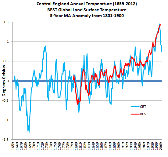
As you also know CET is a good match to BEST ‘global’
Here is a chart showing the BEST global land surface temperature (from KNMI Climate Explorer) and Central England Temperature (HadCET) together, using a five year moving average of the 19th century (before global warming kicked in). (Click image to enlarge.)


Looking at the chart you can see that the local temperature anomaly for central England fluctuates a whole lot more than the global land surface temperature anomaly.  Most people would expect this to be the case, which is why it's surprising that Tony Brown, in his recent article on WUWT, writes (my bold and italics):
...the point I want to put over is that temperature is highly variable throughout the CET record -which is at variance to Dr Mann’s (global) work and the assertions of the Met office.
Naturally it is at variance with the global average temperature.  That is to be expected.  Tony goes on to say:
This is despite a constant level of co2 until around 1900. The temperature decline since 2000 as the CO2 line rises ever further is especially intriguing.
Does Tony think that before 1900 CO2 was the major forcing on global temperature? It wasn't.  As he points out, for the Holocene until at least the mid 1800s, atmospheric CO2 level varied very little.

And why does Tony find it intriguing that in a particular location on earth, temperature dropped for a couple of years.  Let's look at an animation of the modern record for CET just from 1950, with the 1961-1990 anomaly and different moving averages. (Click image to enlarge.)


I've chosen a five year average, an 11 year average and Dr Ben Santer's 17 year average (he says 'at least'). (Well, I took a liberty there - Dr Santer wasn't referring to moving averages.) Does your perception of the trend change looking over different time scales?

Now look behind the moving average trend line at the annual temperature anomalies.  Since 1986 or so, the CET temperatures have generally been considerably higher than those of the previous two decades, with colder than average temperatures in 1996 and 2010.  You'll recall that globally, 2010 was the equal hottest year on record (with 2005).  This demonstrates that the temperature in one small location in the northern hemisphere can't be extrapolated to the whole world.

You want SCARY?  How about a longer perspective...

Finally, how about we step way back and look at global temperatures from a very long term perspective, with the help of Jos Hagelaars and My View on Climate Change.  Using data from Shakun et al, Marcott et al,  HadCRUT4 and adding the IPCC AR4 "middle of the road emissions" projection to 2100. (Click image to enlarge.)


If that looks "scary" then so it should.  Is it any wonder that some fear sensitive souls want you to focus only on two years' temperature in the middle of a small island in the Northern Atlantic?


CO2 has an impact for millenia


CO2 has an impact for millennia.  Changing CO2 has an immediate effect and a very long term effect.  What we have done and continue to do is going to shape the global climate for many centuries. This chart from RealClimate.org and Paleosens 2012 shows the feedbacks and sensitivity to doubling of CO2 over different time scales. (Click image to enlarge.)


Here is a chart from NOAA showing the radiative forcing of long-lived greenhouse gases, relative to 1750. (Click image to enlarge.)


More Denier Weirdness

Here are a few excerpts from the comments to Tony Brown's article, from people who seem to think by looking at a WUWT chart of central England temperatures they suddenly know a whole lot more about climate science than climate science specialists, who have spent a lifetime studying the subject, building on the life work of scientific researchers who have gone before them:

Jer0me is a straight up Dismissive and says:
May 8, 2013 at 4:15 pm  To my mind,almost all of the graphs I have seen can be easily explained by the simple hypothesis that CO2 has no discernible effect on temperature whatsoever. I think this one is no different.

Larry Ledwick (hotrod) plays the stock market with temperature and says:
May 8, 2013 at 4:29 pm  What it shows me is that there is essentially zero correlation between CO2 concentrations and temperatures. Temperature is all over the place when the CO2 concentration was essentially uniform for about 3 centuries and now that CO2 is rising rapidly temperatures spiked in the early phase of the increasing concentration then simply stopped rising as the concentration curve turns up. A stock analyst would look at those two plots and toss out the CO2 concentration as being meaningless for predicting the temperature.

Talk about intriguing, Philip Bradley says:
May 8, 2013 at 5:12 pm  ...Humans have been influencing CO2 levels for millenia. Cutting down forests, killing the herd grazers,  I find the CO2 levels rising from the start of the Industrial Revolution especially questionable. Coal replaced charcoal as the industrial fuel, and producing charcoal with pre-industrial technology requires a fire that burns for about 3 days (I’ve seen it done). Producing large amounts of CO2, black carbon and organic carbon. Whereas, mining coal produces little CO2.

And deniers say climate scientists suffer from hubris!

Thursday, April 25, 2013

Denier Weirdness: WUWT says Watch Out for the Ice Age!

Sou | 10:11 PM Go to the first of 5 comments. Add a comment

On WUWT today, Anthony Watts has posted an article by Ed Hoskins, who is saying that:
....the reversion of our planet to a real ice age is foreseeable.

Ed doesn't say when he thinks this 'foreseeable' ice age is likely to occur.  Let's see what he bases it on to see if we can get a clue.  Here is some of Ed's "evidence", Central England temperatures (CET) of the past twelve years!  (Click on any chart to enlarge it.)


Ed's got way too many lines in the way to see what he's talking about.  We need to get rid of them to see more clearly.  Here's a cleaner chart of CET for the period 2000-2012 from Met Office data.


As you can see, the temperature for the past decade lies above the 1961-1990 mean, except for 2010 when it dipped below by 0.6 degrees Celsius.  I wouldn't recommend trying to draw any conclusions from Ed's 'trend lines'.

Central England is Getting Warmer

How about we look longer term, going back to the 17th Century.


It got pretty cold at the end of the 17th century, then plateaued from the mid-18th century to the late-19th century, then started going up.  Today's CET temperatures are 2.5 degrees Celsius above the lows of the late 17th century!


Let's look more closely at more recent CET temperatures from 1880 to 2012.


Ice age?  It doesn't look like it.

In any case, you won't be able to tell what's happening globally from temperatures in one location.  Ed picks two - Central England and Greenland.  Two isn't sufficient, either.  Funny how some deniers say that three to six thousand locations aren't enough to see global temperature changes, while others like Ed Hoskins seem to  think one or two locations are ample.

Here's the global land-surface temperature trend from NASA.


About the Central England Temperature Record

The UK Met Office website describes the CET thus:
The CET dataset is the longest instrumental record of temperature in the world. The mean, minimum and maximum datasets are updated monthly, with data for a month usually available by the 3rd of the next month. A provisional CET value for the current month is calculated on a daily basis. The mean daily data series begins in 1772 and the mean monthly data in 1659. Mean maximum and minimum daily and monthly data are also available, beginning in 1878.
These daily and monthly temperatures are representative of a roughly triangular area of the United Kingdom enclosed by Lancashire, London and Bristol.

Ed doesn't seem to know all that much about these data, he writes:
It has not been adjusted as have so many other official temperature records.
In contrast, the Met Office states:
The daily series begins in 1772. Manley (1953,1974) compiled most of the monthly series, covering 1659 to 1973. These data were updated to 1991 by Parker et al (1992), when they calculated the daily series. Both series are now kept up to date by the Climate Data Monitoring section of the Hadley Centre, Met Office. Since 1974 the data have been adjusted to allow for urban warming.