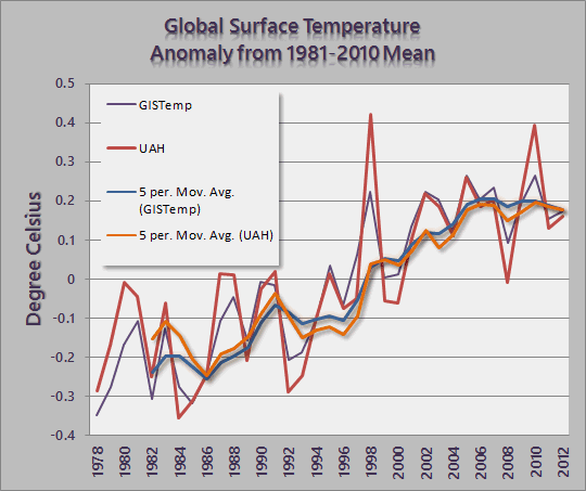
Here is a chart that shows UAH and GISTemp on the same 1981-2010 baseline. They show very similar warming over that period. Data sources: NASA and UAH
The charts below show GISTemp global land and surface temperature anomalies with different baselines. It doesn't matter what baseline you use, the global surface temperature has still gone up by the same amount.
Data source: NASA
Anomaly from twentieth century mean - showing approx: 0.8 degrees higher than 1880.

Anomaly from 1951 to 1980 mean - showing approx: 0.8 degrees higher than 1880.


An animated composite, all showing approx: 0.8 degrees higher than 1880.:

It doesn't matter what the baseline years are. The temperature difference between now and a point in the past will be the same, no matter what years you used as the baseline average.
You do realise that you're trying to explain how the change-in-anomalies is independent of the change-in-baseline to someone who gives the appearance of having a community college standard of mathematics? The same individual could not conceive that it makes no difference if the temperature anomalies are expressed in Kelvin or in degrees Celsius.
ReplyDeleteI applaud and appreciate your efforts but they will be wasted on someone whose responses thus far are stereotypical for low achievers whose educational experiences in a school setting have occurred within a dogma-based institution.
Those who would like a very simple and straightforward demonstration of incredibly robust and reliable the NASA global-average temperature results are should check out these links.
ReplyDelete1) https://docs.google.com/file/d/0B0pXYsr8qYS6LVE1VGdQUFFDVFk/edit?usp=sharing
2) https://docs.google.com/file/d/0B0pXYsr8qYS6Y1d2S2JlU2tSbEE/edit?usp=sharing
The first link shows the official NASA/GISS global temperature-station results vs. the results that you get when you run *raw* GHCN V3 temperature data through a very simple "home-cooked" global-anomaly program. The algorithm really is very simple -- no data "adjustments/homogenization/modification" whatsoever. Just baselining and simple area-weighted averaging.
The second link points to the actual source-code of the program. It is a simple Python script written by Kevin C over at SkepticalScience.com (and very slightly modified my me). Strip out the comments and print statements, and the entire program will fit on a single page!
Run the script per the instructions in the script comments, and you can easily reproduce the results shown at the first link.
The script reads in GHCN V3 data and metadata, crunches the numbers, and spits out the results in .csv format for easy plotting with your favorite spreadsheet program. (I generated the above plot with OpenOffice).
The script can also process rural and urban data separately so that you can compare rural vs urban results and see for yourselves how much of a non-issue "UHI" is. You can also run the GHCN "homogenized" data through the program (same data format) and see how modest the differences between the raw vs. homogenized data results are.
Of all the programming/scripting languages out there, Python is one of the most powerful and easiest to learn. Study the script (with a python tutorial at hand), and you will see how amazingly straightforward the basic global-temperature anomaly averaging procedure is.
Those of you out there who know any loudmouth "skeptic" types who like to brag about how their computer/IT/whatever technical skills make them qualified to attack climate-scientists might want to demonstrate this script to them.
But first get them on the record about UHI, "temperature data manipulation", etc.
--caerbannog
Anyone wishing to confirm this directly can do so using the wonderful Wood for Trees data visualisation tool. It would be properly sceptical to do so, if in doubt.
ReplyDeleteHadCRUT4, GISTEMP, UAH TLT, common 1981 - 2010 baseline; annual means 1979 - present; OLS linear fit