According to a recent blog post by a global warming enthusiast, here, my using the start year of 1979 is “hiding the incline”.
I can categorically state that I’m not hiding the incline.
No, Bob - it wasn't "using the start year" that was the problem...
Bob Tisdale doesn't understand anomalies! Still!
Well, I'm not sure if perennially puzzled Bob is thick as a brick or if he's a plain liar and thinks his readers are thick as bricks.
Going by my article he refers to, one would conclude the former. The reason I say this is because what I was talking about had nothing to do with the start date of the temperature series, but the fact that Bob Tisdale doesn't understand anomalies. Or so it seems. Either that or he is pretending because he thinks his readers are dumb and they won't understand anomalies.
Bob Tisdale was complaining that the baseline year was "alarmist" because it was based on the twentieth century mean instead of the 1981-2010 mean. He reckons that made it look hotter than it is. Truly. That's what he was saying.
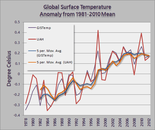
Here is the excerpt from my earlier article:
Now we come to the part where Bob wants to hide the incline. Bob writes:
Second, it’s very obvious that NOAA press releases have degraded to nothing but alarmist babble.Why does he say it's alarmist babble? Well, it's because they do a comparison with the twentieth century mean instead of the 1981-2010 mean. Bob even puts up a picture to show us the difference. Here it is - as always, you can click it to see the larger version if you want to.

If the NCDC had revised their base years to comply with WMO recommendations, the press release wouldn’t have the same alarm-bell ring to it.So Bob, being either a scaredy cat himself and not wanting to face up to the reality of a warming world, or preying on the fears of the scaredy cats at WUWT, decides to rewrite the NCDC media release so that all the little fearful brains at WUWT can stop being alarmed:
Here is the excerpt from the NCDC media release with Bob's suggested changes:
According to NOAA scientists, the globally averaged temperature for June 2013 tied with 2006 as the fifth warmest June since record keeping began in 1880.It also marked the 37th consecutive June and 340th consecutive month (more than 28 years) with a global temperature above the 20th century average.It also marked the 17th consecutive June and 16th consecutive month (less than two years) with a global temperature above the 1981-2010 average. The last below-average June temperature wasJune 1976June 1996 and the last below-average temperature for any month wasFebruary 1985February 2012, though December 2012 was basically zero.
Bob Tisdale is trying to hide the temperature incline!
Bob wants to "hide" the warming by shifting the baseline up! He doesn't want you to know that it's more than 340 months or more than 28 years since any monthly temperature was below the twentieth century average. No-one aged 28 years or younger has ever in their life experienced a month where the global average surface temperature was at or below the average of any month for the entire twentieth century. No-one aged 37 years or younger has ever experienced a June that was colder than the average June temperature in the twentieth century. That's what Bob doesn't want his readers to know. Is Bob Tisdale trying to deceive people? Yes, Bob tried to deceive his readers into thinking there has only been a couple of years of global warming. In the words of the IPCC - it is unequivocal!
You can read the rest here. Is Bob just a poor old befuddled thing or a straight up liar? Either one makes him look pretty silly.
If there is anyone who really doesn't understanding that you cannot hide the incline and pretend it's not warming just by shifting the baseline years, here is another article on the subject.
If you still don't understand it, you can post a question here or there. Don't ask Anthony Watts or Bob Tisdale - they either don't understand anomalies and baselines themselves or think you are too dumb to understand it. Either way, they won't be much help to you!
Click the links below for more on baselines and anomalies:
- Smoked by Wretched Baselines or Panic is in the Eye of the Beholder!
- Bombshell: Anthony Watts embraces Professor Phil Jones of UEA - but fails Anomaly 101
- Update: Anthony Watts Classic: those baffling temperature anomalies
Again, here is an archived version of Bob's article.
From the WUWT comments - who's obsessive and creepy? Anthony Watts
Tommy Roche says:
August 30, 2013 at 6:59 am
Keitho says: “That Sou fella seems a bit driven doesn’t he”.
A bit driven ? His fixation with Anthony staggers along a blurry line somewhere between obsessive and creepy.
REPLY: actually, a “her” see http://wattsupwiththat.com/about-wuwt/my-blog-spawn/
- Anthony
Tommy, if you want obsessive and creepy - Anthony must have been huddled over his computer for months and months, scouring the internet - maybe since August last year, before I started HotWhopper, to try find out who I am and where I work and my old photo stash, ironically of one of the three major fires here this past ten years - more frequent and worse because of global warming. That's what I and other people call obsessive and creepy.
All I do is point out the lies, deceptions and wackiness put out by the illiterati at places like the "the world's most viewed (anti-) climate (science) website", WUWT. Not just from Anthony Watts (he only very rarely writes an article himself) but from a whole host of people.
I focus on the science.
Anthony can't rebut the science so he creepily crawls the internet looking for something irrelevant and personal. It's his style.