SEE ALSO: Just to be clear about Weatherzone
UPDATE 2: The Misandrist Replies
UPDATE: It gets even weirder.
Deniers are a funny lot
I've been getting around the traps and came across this. CeeBee likes my articles and enjoys ragging the deniers on an Australian weather forum where a few of them congregate to mutter in their beards. Following a suggestion he made in the comments over there, I've decided to give a poster called Anthony a bit of a thrill with some attention he doesn't deserve. (As usual, click any image to enlarge it.)

Anthony (not Watts) apparently doesn't accept the HadCRUT4 record but it seems he isn't capable of doing any research of his own. It's enough for him to imply that the data I plotted isn't "fact". We'll come back to that shortly. I notice he's also one of those conspiracy nutters who thinks that people who accept science and say so must be "paid trolls", whereas he does his denying for free.
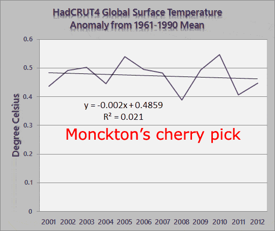
Wonder what he thinks of Christopher Monckton and his tiny little bit of data.
 |
| Data Source: UK Met Office Hadley Centre |
Which brings me to another poster who goes by the name of Locke. Locke was a bit weird. He copied a copy (from CeeBee's copy) of an excerpt from my recent Monckton article. That copy included the chart shown above. In fact it was directly (like 11/2 lines) below the above chart, which he himself pasted that Locke wrote this:

What one cannot help but notice is Locke apparently didn't see the chart he pasted, which went back 162 years to 1850, whereas Monckton's only went back to 2001. And he didn't bother to read my comment about Monckton's chart and my response (relating to the chart below), which was:
If he'd got rid of the noise from seasonal effects and monthly data, and started just one year earlier than 2001, you would have seen something quite different. If he'd started his chart ten years earlier, you'd have noticed the trend starting to show up.
Anthony and Locke add to the evidence supporting my growing opinion of deniers. But never mind that, let's deal with the cherry picking accusation (which was a bit silly when he should have seen the chart going back 162 years) and see what Monckton would have found if he had gone back still another ten years.
 |
| Data Source: UK Met Office Hadley Centre |
The linear trend is even stronger (R2 =0.74 compared to 0.55) and the slope is steeper. Compare that to the trend of Monckton's cherry pick - R2 =0.021. Not worth a cracker!
Getting back to the point I raised earlier on about Anthony thinking HadCRUT4 isn't fact. I wonder if Anthony and Locke will try to argue again that the HadCRUT4 data is dodgy. If they do they'd better tell Christopher Monckton to stop using 'dodgy' data, because his source was HadCRUT4 too. He just used a lot less of it and didn't bother to filter out the seasonal fluctuations or the noise of the monthly weather.
OMG bloody barmy is right
Hang on, you'll need to use this before you read any further:

If you arrived from the home page. click here to read the rest. This article has lots of stuff deniers love to hate, like charts and numbers and I'm conscious that not everyone has a fast internet connection. Don't forget to attach the vice to your head.
More evidence of what I surmise. This would baffle even the most experienced shrink I'm sure. Lewandowsky, who does research into mental models would just love it. Have a gander at how Locke reacted. He wrote (my bold):
I swear I've never come across anyone so disingenuous and hypocritical before in my lifetime.
So 1991-2012 (commencing from Pinatubo) isnt a cherry pick?
So 2000-2012 (commencing from a strong La Nina) isnt a cherry pick?
Credit: Plognark

So 1850-2012 (commencing from the end of the LIA) isnt a cherry pick?
How is it possible that someone can get so blinded by their own ideology?
And AGW proponents wonder why the public doesn't trust them. Your friends site Hotwhopper is appropriately named as that what seem to be what he aspires to achieve.
I particularly liked the way Locke ignored the data, ignored the strong trend and even more that Locke thinks "he" (ie me) cherry picked by using all the data, from a data set that began 162 years ago. And I like the way he completely ignored the chart from 1981 to the present! Plus it was kind of cute that he picked on the start date of 2000, which I only included to emphasise how Monckton deliberately chose 2001 as a start date.
I wonder does Locke think Monckton was a tad disingenuous posting a noisy monthly chart from 2001 to the present? Probably not. On the other hand, his mate Anthony has just written that a noisy monthly chart of the past "16.42 years" is "the post of the year Bill!"
But Locke does think the UK Met Office is cherry picking by starting their global instrumental data set in 1850. And NASA must be cherry picking like crazy to have started their data set in 1870. And what about John Christy and Roy Spencer - they started their data set in 1978 right at the start of the rapid warming. How could they! I mean just how could they start a satellite data set right when warming was heating up! Let's take a look at how awfully shockingly bad are the satellite crowd:
 |
| Data sources: UAH and NASA |
Good grief. Will you just look at that. The satellite people are shysters. They just copied from NASA and added a little bump or two to fool the plebs. It's a conspiracy I tell you. I bet there aren't even any satellites up there or if they are they are there to zap our brains - I heard they use microwave and what else could that be for? Everyone knows you need a thermometer to measure temperature. /s
I bet young Locke would argue that Marcott et al cherry picked the start of the Holocene. And that Shakun et al shouldn't have cherry picked their data set 20,000 or so years ago. :D
 |
| Adapted from Jos Hagelaars |
Maybe I should call Poe. No-one can be that weird, can they?
Update 2 - The Misandrist Replies
Now I'm a misandrist because I don't tolerate sexism according to one of the regulars on that Australian discussion board. Who knew.Anyway, back to Locke. Just to pick him up on a couple of points. His comments are in italics:
Locke: Her rather useless response to my accusations of cherry picking were the usual load of misdirection very similar to type of behaviour Ceebee habitually engages in.
Hmm - it's misdirection to provide data and charts. No wonder fake skeptics have such a hard time knowing back from front and up from down. They can't tell misdirection from direction. (And it's Ms Direction, if you don't mind, not Miss Direction :D)
Locke: I repeat the accusation that the 1991-2012 chart is a cherry pick as is the 1850-2012 chart (its not that hard to find temp charts that give context to the temp changes before and after the little ice age).
Locke: I repeat the accusation that the 1991-2012 chart is a cherry pick as is the 1850-2012 chart (its not that hard to find temp charts that give context to the temp changes before and after the little ice age).
Locke is talking through his trilby. If I'd wanted to cherry pick, presumably from Locke's jaundiced view to show that the world is warming faster than it actually is (as if it could), then I most certainly would not have picked 1991 as the start year. Almost any other neighbouring year had a lower temperature and therefore would have made the linear fit steeper.
Locke: Of course for the 2000-2012 were given the sad excuse that it wasn't just choosing a la Nina year but rather just going 1 year prior to Monckton. I'd be fine with that if it weren't for the other charts presented which give a little more context to the entire discussion.
The context? This guy Locke has a severely warped mental model. I doubt it can be cured. Too far gone. For example, Monckton picks a stretch of 12 years and deliberately starts with the highest year after 1998, which he's learning to avoid, and discards 150 years of data. He could have picked 2010 and he would definitely have got a downward trend. But he might have decided that even the ragtag of deniers at WUWT would not be impressed by someone saying "it's been cooling for two years we're heading for an ice age!" (Hmm, forgot about this - I take back what I said about the ice age. And of course there's this. But that's a whole seven years away!)
Not only did he start with the highest temperature he thought he could get away with, but he fills his data with noise of seasons and weather by plotting monthly data.
On the other hand, my charts spanned up to 162 years and Locke accuses me of cherry picking because I use all of the data.
Locke: So perhaps our friend at whopping lies or whatever she calls her website might provide another feeble excuse why she presented the 1991-2012 range? I mean she accuses me of ignoring the 1981 (not sure why I would have mentioned it as I never regarded it as a cherry pick) but then ignores my obrservation of the 1991-2012 chart being a cherry pick to coincide with Pinatubo.
Before I illustrate I will write some more. One or the other might get through but probably not with Locke. Still other readers might enjoy this. First of all I simply picked a decade as a handy number.
I didn't look at the chart at all to try to pick any particular year. Ten seemed like a nice easy number.
Ten - it's a nice number used for all sorts of things. Look at it. It's even quite visually attractive.
10
It also happens to be a very popular number. Nations base their currencies on it. People use it as the basis for distance, temperature and, oh, all sorts of things. It's easy to add and subtract and multiply. In fact it is a very sweet number all around. The two digits it encompasses are also used for computing - it has a nice binary feel as well as it's quite lovely decimal qualities. No wonder it is so popular.
Secondly I deducted ten years from Monckton's start date. That is all. And when that was queried I was able to show what happens when the period is made even longer, by adding another ten years and looking at 32 years of data. Thirty two years of data is coincidentally the number that Ben Santer et al mentioned in the paper I referred to here, as showing a clear signal above the noise.
I don't know what Locke would have done because he's not saying. And he isn't impressed by numbers that don't accord with what he wants to hear, no matter how strong they are.
Now let's have a look at the numbers and where they sit with their neighbours. I had no idea before doing this what I'd find, but here you go. I've selected just the period being questioned and highlighted the years and shown them as columns so it's easy to see. Best you click the chart to see a larger version.

What a surprise. Locke is wrong again.
I didn't have any reason to check because I wasn't doing anything but showing that a longer period will give you a more solid trend. It's basic statistics. The more data you have the more the signal will emerge from the noise.
Anyway, after Locke started playing the fool I decided to check the numbers. When I did check I found that the years I picked were not the lowest of their neighbours.
In fact the 1991 year that so bothered Locke is higher than all but one year before it in the entire temperature record. And as for the neighbours up the line, you would have to skip over another three whole years to get a year that was hotter. There wasn't a hotter year than 1991 until you get to 1995., as you can see, if I'd been wanting to pick the best year I could have picked any year before 1989 or any year up to 1995 and I would have had a slightly steeper curve than I did.
Locke: Rational discussion is impossible with these people. They think everyone other than them is insane (ala Lewandowsky who she links to). I met this type of person when I used to be involved with religion. Completely impossible to reason with and the main reason I no longer have any involvement with religion (but thats another matter).
I don't think Locke is insane, just mentally disabled when it comes to logical thought and dispassionate discussion about climate. Something like 8% of the population are affected quite severely or so surveys suggest.
Heh, nice job on the deniers Sou - and it's all the more delicious that a female stuck it to them!
ReplyDelete(I won't explain the reason why but the deniers there know...)
Cheers! CeeBee
Your welcome, CeeBee. Thanks for the plug.
DeleteBTW, I love your dancing banana. I'm really glad it survived Yasi :D
Some context for not Watts Antony's "post of the year".
ReplyDeleteI don't know what's more interesting, that fact that they can't see how stupid a cherry pick it is, or the fact that they cant count (1996 to present is 17.42 years and Rose made the same error in his Daily Mail article last year. Not that surprising, cherry picking does preclude inclusiveness).
Kind of interesting though that from 2001 to 2012 the slope of the graph is more or less zero, i.e. horizontal.
ReplyDeleteThe way you have shown the slope/trend line, call it what you want, will always show an increase even if there has been no increase over a substantial time frame, i.e. from 2001 to 2012 in this case.
I agree, there appears to be an increase from 1979/1981 to 2001, but then there has been NO increase as shown on your chart.
The way the trend line has been plotted is not giving the true picture that the data is showing.
Werner, Monckton is the one who is trying to argue that warming has stopped but the time period he used is much too short. Not only that he's deliberately inserted so much noise into his chart that you'd be hard pressed to find the signal even if there were a stronger one.
DeleteBy the way, in the bottom chart that's not a trend line. I just drew those lines to illustrate the point that a lower low to a high will be steeper than a higher low to a high - for our somewhat numerically and graphically-challenged friends.
In the other charts there are linear trend lines as shown, but only as computed in excel. Nothing fancy. Still, the signal is very clear for the twenty two and thirty two year charts IMO. Selecting only twelve or thirteen years is not long enough according to the quick stats test of a linear fit.
I disagree with you when your write: "will always show an increase even if there has been no increase over a substantial time frame, i.e. from 2001 to 2012 in this case."
That's just wrong. If there were no trend it would show up in the numbers and the r sqd is certainly high enough to have confidence in the upward trend. If the trend were to change that would show up in the numbers too. Whether it change to be steeper or shallower slope. You'll have to wait to see what happens.
The numbers don't show what the deniers claim they do without excessive contortions - like saying the surface temperature hasn't risen since 2010. I'd agree with that. But the ice is still melting, the seas are still rising and the oceans are getting hotter.
Of course the big concern is how much and how quickly it will heat up over the next twenty or thirty years and longer. For children who are now ten years old - that's the world they'll be having to cope with. Not a pretty thought.
2001-2012 can only give a truer picture of what we can expect in future (which is, after all, what we're most interested in) is if something changed in 2001, can only be determined in the first place by looking at much more data.
DeleteAs the justly famous SkS Escelator demonstrates, you can find a short periods of decline which clearly didn't represent the future well at all. There's no reason to think this period is any different without some idea of what the new factor is.
Let's face it, the reason deniers are gabbling this mantra so frantically these days is nothing to do with true pictures and everything to do with desperation and a growing, visceral fear of each boreal summer as it approaches. They know that the next El Nino will rob them of even this because in their bowels they know what the true picture is.
(Lest there be any doubt, I have not the least shred of sympathy for them. Quite the opposite, in fact.)