The climate models used by the Intergovernmental Panel on Climate Change (IPCC) are not simulating climate as it exists on Earth.What he was really complaining about was that:
The multi-model mean of climate models used by the Intergovernmental Panel on Climate Change (IPCC) are not simulatingWell, they aren't meant to do that. Climate models are for, you guessed it, climate not weather. The CMIP5 models are used for climate projections as well as learning more about particular aspects of climate. They are pretty good when it comes to global projections. Not as good (but not that bad) when looking at large areas like entire oceans. They are not intended to be used for weather forecasts. (Bob wants them to time ENSO events at the same time as they happen. That won't happen. There are other models specially developed for localised projections looking ahead a few months.)climateas it exists on Earth. year to year variations in the weather as recorded by the older version of Reynold's OI v2 data, when looking at some sections of the ocean.
There were some charts that were noticeable by their absence, so I figured I'd fill in the gaps in his article.
Bob Tisdale and his odd data selection
The first thing I noticed was that posted 26 charts. Yes, that's right - 26 charts, but he mainly only compared Reynold's Optimal Interpolation v2 weekly. There are three points regarding that. The first is that those data only start in the latter part of 1981. The second point is that it might not be the best in any case, as Tom Di Liberto explains. The third is that it's not the latest and greatest, there is another higher resolution data set that's available. Robert Grumbine commented on this here at HotWhopper some time ago, writing:
A few general bits as I know Dick Reynolds professionally. (Aside: He has finally finished retiring.)
One is, the 1 degree weekly OI is not his latest/greatest analysis system. It is a legacy system, run only for the use of the CPC (climate prediction center).
For a decade or more, he (and collaborators, now Viva Banzon and collaborators) have done a 0.25 degree, daily analysis (still using OI methods), with retrospective run back to September, 1981 -- when the AVHRR was first launched. See http://www.ncdc.noaa.gov/sst/ for data.Tom Di Liberto explains the difference this way:
The weekly OISST was developed when ships were the main source of in situ observations, and there is no ship-buoy SST adjustment in it. On the other hand, the latter daily OISST was developed when more buoy data became available, and there is a ship-buoy SST adjustment in it, as in the latest version of ERSST.
CMIP5 actual vs estimated forcings
And Bob didn't point out to his readers that the CMIP5 models weren't populated with actual forcings from around 2006 onwards. What that means is that the last 10 years of projections are based on estimates of forcings, not observations. The actual forcings were different. In particular:
- Solar forcing, which adds to surface temperature, was less. The sun hasn't been putting out quite as much energy in recent years.
- Volcanic forcing, which dampens temperature, was greater.
Models are now closer to observations
So lets fill in some of Bob's gaps. I've used CMIP5 for RCP8.5, though it makes little difference which of the Representative Concentration Pathways are used. (They won't start to diverge noticeably for a short while yet.)
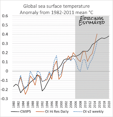
First, here is an annually averaged global sea surface temperature chart using the high resolution data as well as the older Reynolds OI v2.
 |
| Figure 1 | Global sea surface temperature observations and multi-model mean CMIP5 projection. Data sources: Reynold's OI v2 and CMIP5 (tos) RCP8.5 from KNMI Climate Explorer |
The shaded area covers the period when the forcings were from estimates, not from observations. You'll notice that the sea surface temperature was below the model mean for much of that time, but is above it now in the high resolution version.
For comparison, this is how Bob Tisdale saw it - a bit differently, though I don't know why. It could be because he used CMIP5 RCP6.0 whereas I used RCP8.5. As you can see, Bob also chose to use the older version, which for reasons explained above, is not as good as the daily high resolution data set:
 |
| Figure 2 | Bob Tisdale's representation, which differs from Figure 1. Source: WUWT |
The next chart includes data that Bob decided to ignore. It's comparing ERSSTv4 and HadSST1 with CMIP5 for RCP8.5.
 |
| Figure 3 | Global mean sea surface temperature and CMIP5 multi-model mean projection 1880 to 2015. Data sources: ERSST v4, HadSST1 and CMIP5 (tos) RCP8.5 from KNMI Climate Explorer |
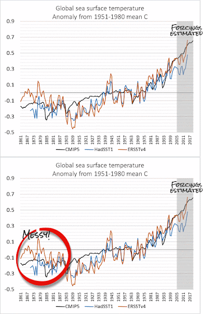
The above chart is messy in the early years, before the twentieth century, when observations of sea surface temperature were very sparse so uncertainty is high. Because of that, and because of data problems in the 1940s, I've also plotted the same data but just from 1951 onwards, as shown below.
 |
| Figure 4 | Global mean sea surface temperature and CMIP5 multi-model mean projection 1951 to 2015. Data sources: ERSST v4, HadSST1 and CMIP5 (tos) RCP8.5 from KNMI Climate Explorer |
What you'll probably notice is the difference between HadSST and ERSST. From around 1979 through to the mid 1990s, ERSST shows higher temperatures than HadSST. And again for most of this century, ERSST is much closer to the CMIP5 projections than HadSST is.
So for all you avid WUWT readers who wondered how the models and different data sets of observations stack up from a global perspective, now you know. And you also know that even though the models have been running hotter than they would have if the forcings hadn't been over-estimated from 2006 onwards, the observations have now mostly risen above the model projections.
CMIP5 updated with observed forcings
There's more. In their recent paper in Nature's Scientific Reports, Michael Mann, Stefan Rahmstorf and co plotted CMIP5, adjusted to take account of the observed forcings. Stefan Rahmstorf has now updated the chart with 2015 GISTemp data. Here is the latest chart. This is of land and sea surface temperature, unlike the ones above. As you can see, the observations are very close to the multi-model mean projection.
 |
| Figure 5 | Global mean surface temperature and CMIP5. The CMIP5 multi-model mean has been updated with recent forcings and GISTemp data includes 2015 observations. Source: Stefan Rahmstorf, updated from Mann15 article in Nature's Scientific Reports. |
References and further reading
Mann, Michael E., Stefan Rahmstorf, Byron A. Steinman, Martin Tingley, and Sonya K. Miller. "The Likelihood of Recent Record Warmth." Scientific reports 6 (2016). doi: 10.1038/srep19831 (open access)
Why trust climate models? It’s a matter of simple science - article by Scott K Johnson at Ars Technica
Exactly the same, but completely different: why we have so many different ways of looking at sea surface temperature - article by Tom Di Liberto on the pros and cons of ERSST vs Optimal Interpolation (OI) data, plus an explanation of the difference between the two main OI products, at climate.gov
From the HotWhopper archives
Weekly Tisdale check: still living under rock
ReplyDeleteOne of the differences between his graph and yours is that he is showing absolute temperatures while you are showing anomalies. It looks like the baseline temperature for the two data sets is different, and so the observed temperature is lower relative to the modeled temperature in his graphs than in yours.
ReplyDeleteI assume that using absolute temps rather than anomalies was a deliberate choice on his part for precisely this reason.
I live in Texas so I’m in the minority who accept climate change. I have a very difficult time finding climate models that I can compare with actual temperature reported each month. Figure 5 looks great but the first question I will be asked is “What is the CMIP5 climate models, all forcings ensemble”. I understand CMIP5 has several different scenarios and I don’t know if figure 5 shows an average of all those scenarios or what. Is there a place on the web where I can see the different scenarios along with the actual temperatures and maybe even projections? And are the CMIP5 models considered the standards for climate models?
ReplyDeleteHank, Figure 5 is an update of the charts in Mann et al 2016. It's the same except that it's got 2015 included. The charts are for "all forcings" runs and are described as follows:
DeleteHere and in subsequent figures, model hemispheric and global mean surface temperatures are based on a combination (“TAS/TOS”) of surface air temperature (“TAS”) over land and sea surface temperature (“TOS”) over ocean. Here and elsewhere in the article, temperatures are defined as anomalies relative to the the long-term (1880-2014) mean.
The different emissions pathways wouldn't have started to diverge yet, though they will soon.
I wouldn't try to compare multi-model means on monthly charts, in part because of the averaging (multi-model) and in part because CMIP models are for long term, not monthly projections.