If you want to visit Antarctica, don't go to Anthony Watts for directions. This is where he says it is:
Warming doesn’t seem to be a problem when you look at the satellite data for the Antarctic continent, in fact, there is a slight cooling:
Anthony Watts has the power to move a continent
This is his "proof" of the slight cooling of the continent of Antarctica:
 |
| Source: WUWT with annotation by HotWhopper |
This is how far he's managed to move the continent:
 |
| Adapted from Google Earth |
(If you're on the home page, click read more to find out why Anthony took it on himself to move an entire continent. Plus there's lots, lots more...)
As for why Anthony decided to move Antarctica, well it's because he took umbrage at scientists explaining why the winter sea ice around Antarctica is expanding. At the ABC they wrote:
The ice is generated in what scientists refer to as "sea ice factories" or polynia - areas of the ocean surface where currents and wind patterns combine to generate sea ice.
"As soon as sea ice is produced in these polynias it is actually transported away from that so more sea ice can be produced," Dr Lieser said.
As the area covered in sea ice expands scientists have said the ice on the continent of Antarctica which is not over the ocean continues to deplete.
CEO of the Antarctic Climate and Ecosystems CRC, Tony Worby, said the warming atmosphere is leading to greater sea ice coverage by changing wind patterns.
"The extent of sea ice is driven by the winds around Antarctica, and we believe that they're increasing in strength and part of that is around the depletion of ozone," he said.
Yes, the extent of sea ice is being driven by wind. The wind is changing and probably increasing in strength in part because of the depletion of ozone and in part because of global warming. But what Anthony Watts wrote was:
Ah ya gotta love the ABC of Australia, they’ll find a way to keep the meme alive no matter what, as reported in WUWT two days ago, they found this guy to give a “the warming is wot dun it” quote with their story about the record level of Antarctic sea ice.
Anthony ignores the role of ozone depletion. Well, he's an ozone hole denier, so that should come as no surprise.
Update: There is an excellent Catalyst video (with transcript) on the ABC website, featuring Mark Curran and Ian Simmonds, and discussing and illustrating the reasons for the sea ice expansion, together with evidence of past changes. It's well worth 8 minutes and 47 seconds from your day. H/t John Byatt. [Sou, 11:22 am Tues 16 Sept]
There was a good article in National Geographic earlier this year, which featured Richard Alley and Eric Rignot. It said in part:
Changes in wind patterns around Antarctica are considered the most likely source of the warmer water, says Alley. As to why the winds have shifted down south, "global warming, the ozone hole, and natural variability are all suspects—the most likely answer being that all three played a role."
Eric Rignot, a glaciologist at the University of California, Irvine and NASA's Jet Propulsion Laboratory, agrees.
"The key is the recent change in ocean circulation," says Rignot, who was the lead author of a paper on melting Antarctic glaciers appearing in Geophysical Research Letters, a journal of the American Geophysical Union.
"Warm waters are already [present in the area] and are being pushed to a different location."
Antarctica isn't cooling
Anthony puts up this image and insists that Antarctica isn't warming, except for peninsula (more on that below).

Look at the legend. All but a bit in the centre and a patch in West Antarctica is getting warmer. (The white around the outside is the ocean, not land, presumably sea ice.)
Yet I don't think that chart is very accurate. It's from 1957 to 2006.
This is from Figure 10.7 of the IPCC report. It shows overall warming too (HadCRUT4 black line), but I know temperature trends are different in different parts of the continent:

Antarctic ice is melting from the "waste heat from the little warm pockets of humanity"
You'll love this next bit. Anthony goes on to say that:
There is some warming along the Antarctic peninsula, but that seems to be related to wind and ocean patterns there, along with possible waste heat from the little warm pockets of humanity where the temperatures are measured. The Antarctic peninsula has the highest concentration of people on the continent, mainly because conditions are much less harsh there.
"Waste heat from little pockets of humanity". Ha ha ha. Do you want to know the population of the Antarctic Peninsula? Wikipedia puts the entire continent's population as:
Several governments maintain permanent manned research stations on the continent. The number of people conducting and supporting scientific research and other work on the continent and its nearby islands varies from about 1,000 in winter to about 5,000 in the summer, giving it a population density between 0.00007 inhabitants per square kilometre (0.00018 /sq mi) and 0.00035 inhabitants per square kilometre (0.00091 /sq mi) at these times.
Say, for argument's sake, that all 1,000 people in winter and all 5,000 people in summer clustered on the peninsula, which they don't of course. That would make the population density around 0.0019 persons per sq km in winter and 0.0096 persons per sq km in summer. Compare that with Hong Kong, which has a population density of 6,544 persons per sq km.
What does this remind you of?
Does Anthony's "waste heat from little pockets of humanity" remind you of anything? Some of you will immediately think of the classic WUWT article (archived here). Anthony put up a picture:
 |
| Source: WUWT who got it from the website of Don Hilger and Gary Toth |
The picture is a stamp from 1997. Anthony didn't say who he pinched it from but it's a fair guess that he "borrowed" it from the philatelic collection of Don Hilger and Gary Toth on their page of Stevenson screen shelters on postage stamps. The image is the one marked "Australian Antarctic Territory L102 maxi"
Now that's not the funny bit. No, the really hilarious part is what Anthony wrote just above the photo:
Regarding that rapid warming of 2C in the last 50 years, just remember that most weather stations in the Antarctic are near humanity, and humanity requires warmth to survive. For example:
And then underneath the photo he wrote:
The Antarctic peninsula is the most populated place in Antarctica.
So he's saying the Antarctic Peninsula has UHI disease!
Setting a bad example
Wait. There's so much more. The "for example" wasn't an example at all. In the comments, Antarctic researcher Ian wrote (my large bold italics):
August 26, 2012 at 2:49 am
Dear WUWT
I guess I owe the world a humble apology for personally contributing so much to the urban heat island in Antarctica, and hence to misinterpreted climate records.
The badly sited meteorological screen in your photo is at an Australian summer camp in the Northern Prince Charles Mountains, near Mt Jacklyn – in the background.
Temperatures measured here were for local information of pilots and field parties only – it is useful to have an idea of how many layers of clothes to put on before exiting your Antarctic shelter. Temperatures here were only measured for less than 2 months over a couple of seasons and have NEVER been used for any climate record.
This photo was taken in the 1988/89 austral summer when I, and a colleague Andy, lived in the UNHEATED shelter nearest to the meteorological station.
I didn’t realise that I was so hot that my body heat could influence temperatures measured on the Antarctic Peninsula, thousands of kilometres away. It must have been Andy!!!
Ian
Don't go away yet. There is still more. Glenn Tamblyn piped up with:
August 27, 2012 at 3:40 am
Anthony
Correct me if I am wrong here but, as an Australian, I was not aware that Australia had any bases in the Antarctic Penninsular – you know, south of South America and all that. And the photo you show has been identified by Ian as being from a very long way away from the Antarctic Pennisular.
When I mouse over the photo it is labelled as australian_antarctic_postcard.jpg. And it even has a stamp with the ANARE logo on it (Australian National Antarctic Research Expedition).
So what on earth has that photo got to do with a post about the Antarctic Penninsular?
Then when commenters here started trying to dissect the ‘station quality’ issues of this site, you didn’t even mention that the photo has zero to do with the subject of the post.
That perhaps going into the detail of how elevated the met station in the photo might be has zero relevence since the station isn’t in the Antarctic Penninsular, isn’t part of any climate record, and only operated few a few months a year as a service to Antarctic pilots.
Did you point this out to any of the commenters here? Why not?
To which Anthony replied:
REPLY: It illustrates that weather stations in Antarctica and heat generating/using humanity are in proximity, the same thing happens in the Arctic, such as at the DEW line stations, where they’d “make up temperatures” rather than brave going outside at times.
http://wattsupwiththat.com/2008/07/17/fabricating-temperatures-on-the-dew-line/
Not hard to understand really, people don’t place the weather stations so far away from the huts that they have to risk death to get a reading in subzero temperatures and white out blizzards. – Anthony
Oh my. Anthony reckons that a weather station that was "never" used for any climate record, which was located thousands of kilometres from the Antarctic Peninsula, is in proximity to "heat generating/using humanity!!!
If you want to see the power of "heat generating humanity" in Antarctica, here it is, courtesy of Anthony Watts:

Oh, there is so much to make fun of in that thread. It made the rounds of climate hawks before Anthony shut it down. And some of them couldn't resist. I'll just pick one more:
mandas asked if it was UHI.
August 27, 2012 at 4:07 pm
“….Regarding that rapid warming of 2C in the last 50 years, just remember that most weather stations in the Antarctic are near humanity, and humanity requires warmth to survive….”
So you’re saying that warming in the Antarctic is due to UHI????
Keep it up Anthony, the farce is strong with this one.
REPLY: No dumkopf, there is no UHI since there’s no “urban” in Antarctica. That’s your made up farce. I’m saying that weather stations, like the one shown, are almost always next to human habitation where it is warmer. Really how hard can it be to understand this, especially with a photo?- Anthony
Umm, Anthony - you dumkopf, you really should read your comments before making such an idiot of yourself. Plus, what he's really saying, since climate records are anomalies and trends, is that humans get hotter and hotter and hotter and hotter and hotter and hotter and never stop getting hotter. And all that body heat passes right through the icy winds of Antarctica, right through the Stevenson screen (3,000 plus km away) and land right on the thermometer. Now you won't find that happening in an urban heat island in the middle of a city!
If you want more, go to RabettRun.
From the WUWT comments
As Steve Keohane wrote:
September 15, 2014 at 8:38 am
I wonder if reading too much of this nonsense causes brain damage, which might explain its persistence.
Churning gets the dates wrong and says:
September 15, 2014 at 8:49 am
“The extent of sea ice is driven by the winds around Antarctica, and we believe that they’re increasing in strength and part of that is around the depletion of ozone,” he said.
The depletion of ozone (the ozone hole) was first discovered during IGY 1957. Sure took a long time to see the effect on the wind!
Nope. NASA states that in 1956 the British Antarctic Expedition started monitoring ozone in preparation for the International Geophysical Year (IGY) of 1957. [Corrected from 1957 to 1956, thanks to Anon in the comments for pointing me to the Dobson paper. Reference is the same as that I previously provided for the chart below. Sou. 16 Sept 14]
The hole wasn't reported in the literature until 1985. Because:
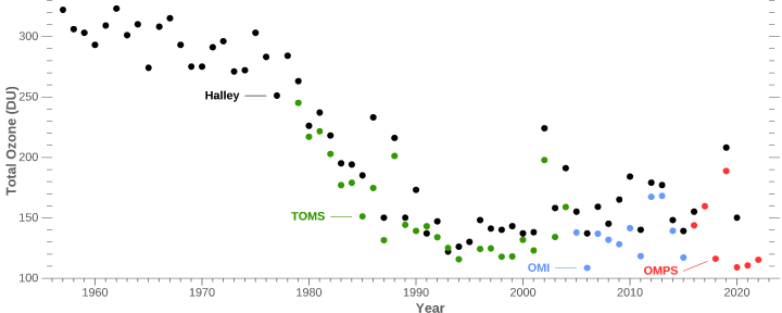 |
| Instruments on the ground (at Halley) and high above Antarctica (the Total Ozone Mapping Spectrometer [TOMS] and Ozone Monitoring Instrument [OMI]) measured an acute drop in total atmospheric ozone during October in the early and middle 1980s. (Halley data supplied by J. D. Shanklin, British Antarctic Survey ). Source: NASA |
Transcript at bottom http://www.abc.net.au/catalyst/stories/4056545.htm
ReplyDeleteThanks, John. That's excellent.
Delete70s to 60s
ReplyDeletejesus these people are unbelievably stupid. I mean come on!! it says it right there in the freakin graph!!
cabc
Points of interest:
ReplyDeleteNaively, 60-70S would actually make a little sense in relation to Antarctic sea ice, since the Antarctic coast ranges from around 65-78S. But then Watts does really seem to be talking about the continent itself...
As for the source for his temperature graph – it's none other than RSS TLT. No surprise there.
I recognize it from seeing deniers link to it. I think the link is usually to Goddard's site
ReplyDeleteSo in one graph that they claim shows a cooling Antarctica, we have
1 - RSS, an outlier data set
2 - Tropospheric temps, not surface temps
3 - Just 60S to 70S
Is there any measure that would be less representative of antarctica than that?
cabc
0-10S?
DeleteOh yes. It could have been worse. One time Anthony put up an RSS chart going from the equator to 70S.
Delete"Nope. the British Antarctic Expedition started monitoring ozone in International Geophysical Year (IGY) of 1957. The hole wasn't reported in the literature until 1985."
ReplyDeleteActually the decline of ozone in spring was observed back in the late 50's at the French Antarctic Observatory at Dumont d'Urville and written up by Dobson himself in 1968 ("Forty Years' Research on Atmospheric Ozone at Oxford: A History" (Applied Optics, March 1968).
But in those days no one could work out how to blame it on mankind/capitalism/western development being that CFC use wasn't all that prevalent then. So it was just treated as a natural phenomena.
Of coarse these days we "know" that any changes to the observed climate are caused by man.
What Dobson wrote about was the difference in seasonal ups and downs between the north and south poles, not the ozone hole. I'm surprised you even know about it, given you are pretending to be a conspiracy theory nutter of the paranoid kind.
DeleteThat's a pretence, no doubt. You are in the business of disinformation thinking that readers here are as disinclined to check as WUWT fans are.
Here is a link to the paper:
http://www.mhs.ox.ac.uk/wp-content/uploads/ozone_dobson_1968.pdf
This is probably the passage that Anon was referring to:
One of the more interesting results on atmospheric ozone which came out of the IGY was the discovery of the peculiar annual variation of ozone at Halley Bay (Fig. 16). This particular ozone instrument had been to Shotover to be checked up immediately before leaving England. Moreover, Evans, who took the original observations at Halley Bay, had also been to Shotover to become familiar with the working of the instrument and its maintainence. The annual variation of ozone at Spitzbergen was fairly well known at that time, so, assuming a six months difference, we knew what to expect. However, when the monthly telegrams from Halley Bay began to arrive and were plotted alongside the Spitzbergen curve, the values for September and October 1956 were about 150 units lower than was expected.
We naturally thought that Evans had made some large mistake or that, in spite of checking just before leaving England, the instrument had developed some fault. In November the ozone values suddenly jumped up to those expected from the Spitzbergen results. It was not until a year later, when the same type of annual variation was repeated, that we realized that the early results were indeed correct and that Halley Bay showed most interesting difference from other parts of the world. It was clear that the winter vortex over the South Pole was maintained late into the spring and that this kept the ozone values low. When it suddenly broke up in November both the ozone values and the stratosphere temperatures suddenly rose.
Just the same, I have to thank Anon for referring to the paper (despite no links), because reading it alerted me to the fact I wrongly stated the Antarctic measurements started in 1957 when they started in 1956. Fixed now.
DeleteI just wanted to point out that Watts has clearly altered his post and now has a graph covering 60S-85S.
ReplyDeleteAt first I wondered if it was always part of his post and that you had somehow missed it (or horror of horrors, deliberately ignored it) in your anxiety to assert that Watts didn't know here Antarctica is. But then I realised you'd never do something so underhanded.
So the only logical explanation is that Watts, having read and been shamed by your post, surreptitiously added the new graph showing 60S-85S
Sou is used to these shenanigans by AW - why do you think he uses archive links? If you click on the hyperlink under "he says" in the 2nd sentence of the post you'll be taken to the archive that Sou saved.
Deletehttps://archive.today/p61YB#selection-519.0-519.137
Watts tweeted his original figure showing the migration of Antarctica
DeleteIt seems that the increase in Antarctic winter sea ice extent is as much a function of the warming continental ice cap as it is to the changing wind patterns. Apparently water from melting glaciers is pouring off into the ocean and, because fresh water is not as dense, it forms a low-saline layer on the sea surface. Being fresher water it more easily freezes to form sea ice.
ReplyDeleteSo, in other words, the increase in winter sea ice extent is proof that the Antarctic is warming. Explanation source.
Thanks for adding that, John. It makes sense. Particularly with the melting of WAIS and even parts of East Antarctica now. It's a worry.
DeleteI don't think you need to worry too much. The excess in winter sea ice is mostly at the outer periphery, which is between several hundred and over a thousand kilometres from the melting glaciers.
DeletePresumably they do most of their melting in the summer. It seems far-fetched to suggest that 9 months later all that melt water has found its way under the existing sea-ice, only to pop up at 60 degrees South, without being thoroughly mixed by the "increased winds", and then quickly freeze over.
Still, if you have figures on how the ocean surface salinity at 60 south has fluctuated over the last couple of decades, I stand to be corrected.
You've got it back to front, Anonymous.
DeleteThat sea ice is extending at the periphery is not because it's forming at the periphery, it isn't. It's being driven out to the periphery by the winds where it eventually quickly melts as it gets warmer when summer comes again.
The ice is forming in polynas which form because the wind is driving ice further north, creating holes which freeze over. Also there is more ice forming around the continent with more ice going into the water, making the water fresher.
Yes - that could explain it - polynyas opening up near the continent, where it's cold enough for them to freeze quickly, while the extra ice is blown further north.
DeleteThat would imply a stronger southerly component to the wind between about 60 and 75 degrees south. I wonder if such an increase has been measured directly, in order to support this conjecture, or even deduced indirectly, by comparing pressure gradients between years of high ice cover, such as 2012,13 and 14 with low ice years such as 2008 and 2011.
Or is it just a plausible theory?
You may think that the population of the Antartic Peninsula wouldn't have that much effect on Antarctic temprs, but I reckon you'd be wrong. Remember, according to statistician, geometrician and god-botherer Ross McKitrick, there's 59 million people living there. Surely that many people would have some effect?
ReplyDelete'The picture is a stamp from 1997. Anthony didn't say who he pinched it from but it's a fair guess that he "borrowed" it from the philatelic collection of Don Hilger and Gary Toth on their page of Stevenson screen shelters on postage stamps. The image is the one marked "Australian Antarctic Territory L102 maxi"'
ReplyDeleteI thought the best thing about this WUWT classic was that not only do those tents not have any UHI effect, a scientists who was there wrote in the comments that that Stevenson screen was only used for logistical planning in the camp (how many sweaters to put on before going out). The temperature measurements are made with an automatic weather station far from the camp.