 Deniers at places like wattsupwiththat.com and elsewhere are every bit as weird and incomprehensible as the people who say they like Donald Trump for his honesty. They'd rather be lied to than have to deal with facts. (I've been distracted by this amazing behaviour from the new White House press secretary, which given the source is a zillion times worse than run-of-the-mill climate conspiracy blogs, which everyone who's sensible knows are only for nutters. One expects politicians to distract and divert, but one does not expect the White House to flat out lie to the American people and the world.)
Time to get away from the utter nutters in the White House and back to the utter nutters on denier blogs. There were the expected protests about the recent surface temperature announcement of yet another Hottest Year on Record - for the third year in a row.
Anthony Watts distracts with US temperature
Anthony Watts wrote an article ridiculing, but not disputing, the fact that last year was yet another hottest year ever in the instrumental record (archived here). It was the classic divert to distract manipulation favoured by science deniers. Anthony was trying to distract his readers from the hottest year on record. His headline was: "@NOAA data demonstrates that 2016 was not the ‘hottest year ever’ in the USA".
Now I don't know if the message he was wanting to send was one of these:
- "it can't be the hottest year on record globally because it was only the second hottest year on record in the USA" or perhaps
- "don't believe me when I dispute US temperature data, the NOAA record of USA temperatures is accurate after all", or maybe
- "it wasn't El Nino so much as the Arctic temperatures that caused the hottest year on record", or it could have been
- "I think my fans are so dumb and dim that they'll think that if the USA isn't the hottest year on record, then it can't have been the hottest year on record for the planet as a whole", or was it
- "the United States of America is the only place in the world that counts for anything. Ignore the rest.".
Anthony picked on the front page article by Justin Gillis in the New York Times, which linked to an article by Jugal K. Patel, with some terrific graphics.
If you're trying to figure out the message that Anthony was wanting to send to his conspiracy theorists, he explained that the Arctic has been very hot lately. He appeared to be trying to suggest that this isn't really true by showing how there weren't a huge number of land-based weather stations in the Arctic ocean :)
What he didn't point out is that the extraordinary Arctic warming is supported by the record low ice extent. The charts below are from the National Snow and Ice Data Center (NSIDC) interactive chart of Arctic sea ice extent. It's been the lowest on record since late October last year.
 |
| Figure 1 | Arctic sea ice extent for the first few days of the year, for January. Source: NSIDC |
 |
| Figure 2 | Arctic sea ice extent for the first few days of the year, for the latter part of the year. Source: NSIDC |
What Anthony did was put up a chart of GHCN version 2 temperature stations. First of all, GHCN is only land temperature, not ocean temperature, and most of the Arctic is sea, not land.
Secondly, both NOAA and NASA now use GHCN version 3, not version 2, and there are a lot of stations used. From NOAA:
The Global Historical Climatology Network - Daily (GHCN-Daily) dataset integrates daily climate observations from approximately 30 different data sources. Version 3 was released in September 2012 with the addition of data from two additional station networks. Changes to the processing system associated with the version 3 release also allowed for updates to occur 7 days a week rather than only on most weekdays. Version 3 contains station-based measurements from well over 90,000 land-based stations worldwide, about two thirds of which are for precipitation measurement only. Other meteorological elements include, but are not limited to, daily maximum and minimum temperature, temperature at the time of observation, snowfall and snow depth. Over 25,000 stations are regularly updated with observations from within roughly the last month. The dataset is also routinely reconstructed (usually every week) from its roughly 30 data sources to ensure that GHCN-Daily is generally in sync with its growing list of constituent sources. During this process, quality assurance checks are applied to the full dataset. Where possible, GHCN-Daily station data are also updated daily from a variety of data streams. Station values for each daily update also undergo a suite of quality checks.Then his chart was a flat chart, which makes the distances at the poles look much greater than they really are. Here is Anthony's chart of version 2, as he presented it.
 |
| Figure 3 | WUWT chart of GHCN v2 land-based weather stations. Source: WUWT |
Here is Anthony's chart showing the proper distances:
 |
| Figure 4 | WUWT chart projected onto the globe. Derived from maptoglobe.bitbucket.org |
Next is the flat chart shown for version 3 (not version 2) from NOAA onto a globe projection:
 |
| Figure 5 | GHCN v3 weather stations projected onto globe. Source: NOAA, adapted using http://maptoglobe.bitbucket.org/ |
About the only thing that Anthony got right was that there are not as many surface instruments to monitor surface temperature in the Arctic circle as there are in some other parts of the world. This is in part because the Arctic ocean tends to ice up in winter. However you may recall that scientists have attempted to address that problem by using observations from high latitude weather stations, radiosondes and satellites. What Kevin Cowtan and Robert Way found and reported in their 2014 paper, was that the Met Office Hadley Centre data set was underestimating the temperature in the Arctic, because it misses these data and doesn't try to fill in the gaps. As Roz Pidcock at Carbon Brief has reported,
Nasa’s GISTEMP uses statistical methods to fill in gaps using surrounding measurements. How much each measurement influences the final value depends on how close it is geographically to the missing point. NOAA follows a similar process for the MLOST dataset.
HadCRUT4 is the only dataset to leave regions with missing data blank, rather than try to fill them in. This effectively assumes temperatures there are in line with the global average.
This wouldn’t be a issue if the world was warming at the same rate everywhere. But data suggests the Arctic, for example, is warming more than twice as fast as the global average.
Finally, Anthony Watts admits that contrary to his often asserted claims, the NOAA historical temperature record is virtually the same as the pristine US climate reference network data. There's nothing wrong with NOAA record of US ClimDiv temperature (using many more weather stations). He wrote:
What happens if we select the state-of-the-art pristine U.S. Climate Reference Network data?
Same answer...
Cool times ahead? What a plonker!
But then he goes and spoils it all by suggesting an ice age cometh (because 2016 was "only" the second hottest year in the USA), writing "Cool times ahead!"
What a plonker!
Bob Tisdale misrepresents models and observations of sea surface temperature
Bob Tisdale put together some wonky dubious charts supposedly of sea surface temperature compared with CMIP5 multi-model means in different ocean basins (archived here). Bob studiously avoided comparing anomalies because they would have looked too similar. The way he presented things, he made it look as if there was a big difference, but there isn't as you'll see below. Bob insisted on comparing what he decided were actual sea surface temperatures, arguing (wrongly) that the "SST data suppliers" report as absolute temperatures. On the contrary, NOAA reports ERSST v4 as anomalies, and so does the UK Met Office Hadley Centre, with HadSST v3.
I haven't bothered to go and work out the different basins and compare them with models, which is what Bob did. However I have plotted the global average sea surface temperatures with the CMIP5 multi-model mean. The results are below.
First - all the results from NOAA ERSST v4 and the UK Met Office HadSST v3. You can see that from around 1900 up to around the middle of last century, the models were running warmer than the reported observations.
 |
| Figure 6 | Global sea surface temperature compared with CMIP5 multi-model mean - from 1861. Data sources: KNMI Climate Explorer for CMIP5, UK Met Office Hadley Centre, and NOAA |
Now from 1951, where there are still differences between models and observations for the first few years, but from the 1970s onwards they are remarkably close.
 |
| Figure 7 | Global sea surface temperature compared with CMIP5 multi-model mean - from 1951. Data sources: KNMI Climate Explorer for CMIP5, UK Met Office Hadley Centre, and NOAA |
If you zoom in on the last four decades, there is very little difference. They are very tightly aligned, particularly given that the timing of things like ENSO events aren't expected to be synchronous with observations.
 |
| Figure 8 | Global sea surface temperature compared with CMIP5 multi-model mean. Data sources: KNMI Climate Explorer for CMIP5, UK Met Office Hadley Centre, and NOAA |
For the final word on the subject of sea surface temperatures, I'll refer you to the recent study by Zeke Hausfather and co, who found that of all the data sets, ERSST v4 was probably the best.
Berkeley Earth reported 2016 as the hottest year on record
Anthony Watts did post the press release from Berkeley Earth, with no comment although he added his own headline (archived here). Anthony's headline was from half of a quote from Robert Rohde, who was reported as writing:
The record temperature in 2016 appears to come from a strong El Nino imposed on top of a long-term global warming trend that continues unabated.No prizes for guessing which part Anthony left out of his headline.
David Whitehouse's weird adjustments were picked up by Anthony Watts
Another weak and wrong protest was from David Whitehouse of the UK denier lobby group the Global Warming Policy Foundation (GWPF) (archived here from WUWT). He did something really weird.
David wrote about HadCRUT4 data released a couple of days ago. Because it doesn't include much of the Arctic (where it has warmed the most, recently), the recent years data is lower than from some other data sets. Last year was almost identical to 2015 - just 0.013 °C higher. The chart below is interactive, so you can hover over it to see the data point for each year.
Figure 9 | Global mean surface temperature, annual median. The temperature anomaly is the difference from the 1961-1990 average. Data source: UK Met Office, Hadley Centre
What David did was take a partial quote from the UK Met Office press release and very selectively apply it to the 2015 and 2016 data. The quote in full was:
“A particularly strong El Niño event contributed about 0.2C to the annual average for 2016, which was about 1.1C above the long term average from 1850 to 1900. However, the main contributor to warming over the last 150 years is human influence on climate from increasing greenhouse gases in the atmosphere.”I've highlighted the part that David Whitehouse ignored.
What David did do was deduct 0.2 °C from the 2015 and 2016 data. What he didn't do was deduct anything from the strong El Nino years of 1997 and 1998 (or to any other year that had an ENSO event). That's called denial and disinformation.
Here's an animation to demonstrate the con from David Whitehouse. He substracted 0.2 °C from each of 2015 and 2016, but didn't subtract anything from 1997 or 1998, calling those years the "start of the pause". That's what's called deliberate deception.
 |
| Figure 10 | Animation showing how David Whitehouse deducted 0.2 C from 2015 and 2016, but not from 1997 or 1998. Data source: UK Met Office, Hadley Centre |
The animation in Figure 10 is overly simplistic. It doesn't include real adjustments for ENSO, solar variation or volcanic eruptions, which is what Tamino has done for four data sets. He used different baselines for each so that you can see the trend more clearly.
 |
| Figure 11 | Global surface temperature anomalies with the impact of ENSO events, volcanic eruptions and solar variations removed. Credit: Tamino |
Gavin Schmidt showed a chart just removing the effect of ENSO events for NASA data:
 |
| Figure 12 | NASA surface temperature record with the impact of ENSO events removed. Source: Gavin Schmidt, Director of NASA GISS |
 |
| Figure 13 | Another chart of NASA surface temperature data with the impact of solar variation, volcanic eruptions, and ENSO events removed. Credit: Things Break |
From the WUWT comments
Once again this article is a bit too long, so I'll only put up a few thoughts from the crazies at WUWT. Most of them are trying on one of several arguments, all equally silly:
- it hasn't warmed
- it has warmed but it's from a magical little ice age bounce and nothing unusual
- all the weather agencies are lying about the data, and have been committing fraud for decades
- I don't believe it because I don't want to believe it.
Some people in the world are just starting realising that Donald Trump and GOP politicians are using the tactics of wacky conspiracy theorists, the same tactics that climate conspiracy nutters have been using for years.
Conspiracy theorist Pamela Gray makes up a false insinuation and wants all the world's weather agency staff "barred from public office for life". (Or maybe she wants the White House press secretary, Sean Spicer, banned from public office for life.):
January 19, 2017 at 11:47 am
ONLY in climate science do we have made-up data. If this were a new drug the researchers would have their license to practice permanently revoked. I’ve done research and published. Making up data, even for my small study would have been grounds for dismissal and revoke of three licenses to practice, plus barred from public employment for life.
Stephen Heins comment is equally as ambiguous. Is he accusing WUWTers of being cowards?
January 19, 2017 at 11:52 am
“A gang is often where a coward goes to hide.”
Anonymous
MarkW thinks that three hottest years on record in a row is "perfectly normal" - how weird is that? How does he explain why all the previous positive PDO or El Nino years over the last several millenia weren't just as hot as the last three years?
January 19, 2017 at 12:06 pm
Which is precisely what happens every time the PDO goes into a warm phase. That goes double for the year or so following a major El Nino.
As always, the trolls try to take a perfectly normal event and try to use it to prove their pet religion.
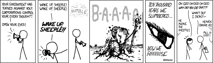
Forrest Gardener is closing his ears to the warnings of climate change. He doesn't want to believe it, so he doesn't, and all but uses the conspiracy theorists' favourite term.
January 19, 2017 at 1:08 pm
It must have been awfully disappointing for the boy who cried wolf when there really was a wolf and nobody believed him. Not to mention how disappointing it must have been for the sheep.
This is from XKCD:
Dave in Canmore is also "very weird" and shows how he can't read a temperature chart. He's out by an order of magnitude. Even HadCRUT4 shows that 2016 was 0.24 C hotter than 1998 (see Figure 9 above). (GISTemp, which takes in the Arctic, shows it 0.35 C hotter.)
January 19, 2017 at 8:39 am
Observed data shows 2016 El Niño was warmer than the 1998 El Niño by a whole 2 one hundredths of a degree! Although no part of my brain finds one one hundredths of a degree per decade very weird.
Dr. Deanster chooses to ignore all the measured data from the past 160 years or so. He wants to "believe" that "these people" are just using models.
January 19, 2017 at 8:12 am
These people are a perfect example of what happens with intellectual inbreeding.
The globe has warmed, true, … caused by humans …. ummm … just where is the empiric evidence for that?? There is none outside of the virtual world of computers. WE DON’T LIVE in the computer.
ANOTHER INTERESTING touch of hypocrisy …. the MWP, LIA are alleged by these morons to be a “regional event” …. but then go on to allow the Arctic … another “regional event” to dictate “global” temperature.
Our government should transfer ALL of the funding of Climate Change to the study of Mental Health … so maybe they can figure out why these people are so dang stupid. … and come up with a stupid pill to fix it.
These people are seriously weird. If you wonder whether humanity will survive the next century or so, let's just hope that it's not determined by the crazies at WUWT. Look to all the men and women around the world who marched in the past couple of days instead, and take hope.
References and further reading
Front page New York Times - with the hottest year on record, 18 January 2017
Earth Sets a Temperature Record for the Third Straight Year - article by Justin Gillis at the New York Times, 18 January 2017
How 2016 Became Earth’s Hottest Year on Record - article by Jugal K. Patel at the New York Times, with excellent graphics - 18 January 2017
Explainer: How do scientists measure global temperature? - article by Roz Pidcock at Carbon Brief, January 2015
A second half dip, but 2016 hottest on record - Article at Berkeley Earth
The Pause that Never Happened - article by Tamino at Open Mind, 19 January 2016
Foster, Grant, and Stefan Rahmstorf. "Global temperature evolution 1979–2010." Environmental Research Letters 6, no. 4 (2011): 044022. DOI: http://dx.doi.org/10.1088/1748-9326/6/4/044022 (open access)
Zeke Hausfather, Kevin Cowtan, David C. Clarke, Peter Jacobs, Mark Richardson, and Robert Rohde. "Assessing recent warming using instrumentally homogeneous sea surface temperature records." Science Advances 3. no. 1 (2017): e1601207 (open access)
White House press secretary attacks media for accurately reporting inauguration crowds - CNN January 21 2017 - where Sean Spicer complained about tweets, complained about the numbers at Trump's inauguration, told multiple lies one after another, and refused to take any questions.
With False Claims, Trump Attacks Media on Turnout and Intelligence Rift - The New York Times, 21 January 2017
Pictures From Women’s Marches on Every Continent - The New York Times, 21 January 2017
From the HotWhopper archives
- 2016 is the hottest year on record - three in a row now - January 2017, with lots of charts
- The winner is NOAA - for global sea surface temperature - January 2017, how NOAA sea surface temperature is the most accurate of all
- Anthony Watts' #AGU15 poster on US temperature trends - December 2015
So strident, so righteous, and yet they couldn't be bothered to turn up for the inauguration.
ReplyDeleteThis comment has been removed by the author.
DeleteIt's actually disturbing. If the low inauguration attendance means the Trump "supporters" do not care, it means they did not care about their vote, either.
DeleteMy gut feel is the whole mess was a protest vote against Senator Clinton.
They probably sent their sock puppets to the inauguration. Sock puppets do not show up on photos.
DeleteI think it was Bill Maher who told us not to expect a reset or a pivot, saying "there is no President inside the fat suit."
DeleteAnd so begins 2017.
ReplyDeleteIf these few days are the direction of statements from positions of power one has to take stock.
As to the deluded fringe who comment on some dismal blog site one can only realise that the education system is not delivering people who are supposed to leave with more knowledge than when they entered.
I do think it is of note that there have been a lot of protest marches, which it would appear were mainly organised by women, obviously from the political perspective the new president has a problem with relation to women.
I do not see this situation changing anytime soon.
It's hilarious. All that arm waving about the climate being chaotic, and they're completely wedded to linear thinking.
ReplyDeleteMy take on the message from the new White House press secretary, who has the eyes of a Baptist hysteric, was that you WILL accept everything Trump says, even when it contradicts the evidence of your own eyes, and you will NEVER contradict or criticise him.
ReplyDeleteNo surprise there. It's not a question of will it be bad; it's a question of how bad is it going to be?
Any hope that the prolific lying would stop once Trump took office has been swept away by the "best attended inauguration ever" lies. Its the Ministry of Truth from now on. If he trashes the economy then expect faked GDP figures. If people start disappearing to Guantanamo Bay again then its not happening. Its all media lies. Orwell was off by 32 years.
DeleteTo me it seemed like the tactics of a religious cult, like announcing that their supreme leader can levitate. They know that most people will see the claim as ridiculous, but those who really want to believe in the Leader will have to accept it and will then be willing to believe anything.
DeleteThe new buzz phrase: "Alternative Facts or Alt-facts)
ReplyDeleteI'd be cautious about taking seriously anything from Dave in Canmore.
ReplyDeleteMike from Canmore is a famous figure in Canadian humour.
https://en.wikipedia.org/wiki/Mike,_from_Canmore.
Dave might be serious or just mocking WUWT.
Facts according to nazis.
ReplyDeleteNow call 'm that too.
There is nothing 'hilarious' going on. Shouldn't laugh at battle stations. Should concentrate and observe.
Although lalala and clap your ears (-> 'those the Gods wish to destroy, they first strike with insanity') might actually be the best way to say goodbye to humanity + 70% of all other species.
Of potential interest:
ReplyDeletehttps://www.cam.ac.uk/research/news/psychological-vaccine-could-help-immunise-public-against-fake-news-on-climate-change-study
http://onlinelibrary.wiley.com/doi/10.1002/gch2.201600008/abstract