Central England is Just a Dot on an Island in the North Atlantic
Here is a map showing Central England (click image to enlarge):

Climate science deniers like the Central England Temperature (CET) data series. For example, Monckton uses it quite a lot as a 'proxy' for global temperatures. While Tony Brown (climatereason) writes on WUWT:
As you also know CET is a good match to BEST ‘global’Here is a chart showing the BEST global land surface temperature (from KNMI Climate Explorer) and Central England Temperature (HadCET) together, using a five year moving average of the 19th century (before global warming kicked in). (Click image to enlarge.)
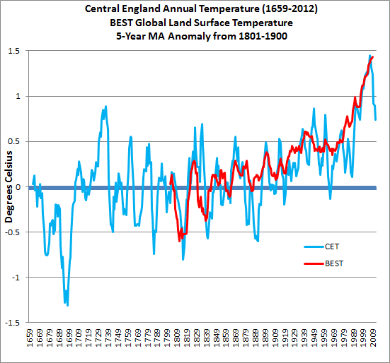
Looking at the chart you can see that the local temperature anomaly for central England fluctuates a whole lot more than the global land surface temperature anomaly. Most people would expect this to be the case, which is why it's surprising that Tony Brown, in his recent article on WUWT, writes (my bold and italics):
...the point I want to put over is that temperature is highly variable throughout the CET record -which is at variance to Dr Mann’s (global) work and the assertions of the Met office.Naturally it is at variance with the global average temperature. That is to be expected. Tony goes on to say:
This is despite a constant level of co2 until around 1900. The temperature decline since 2000 as the CO2 line rises ever further is especially intriguing.Does Tony think that before 1900 CO2 was the major forcing on global temperature? It wasn't. As he points out, for the Holocene until at least the mid 1800s, atmospheric CO2 level varied very little.
And why does Tony find it intriguing that in a particular location on earth, temperature dropped for a couple of years. Let's look at an animation of the modern record for CET just from 1950, with the 1961-1990 anomaly and different moving averages. (Click image to enlarge.)

I've chosen a five year average, an 11 year average and Dr Ben Santer's 17 year average (he says 'at least'). (Well, I took a liberty there - Dr Santer wasn't referring to moving averages.) Does your perception of the trend change looking over different time scales?
Now look behind the moving average trend line at the annual temperature anomalies. Since 1986 or so, the CET temperatures have generally been considerably higher than those of the previous two decades, with colder than average temperatures in 1996 and 2010. You'll recall that globally, 2010 was the equal hottest year on record (with 2005). This demonstrates that the temperature in one small location in the northern hemisphere can't be extrapolated to the whole world.
You want SCARY? How about a longer perspective...
Finally, how about we step way back and look at global temperatures from a very long term perspective, with the help of Jos Hagelaars and My View on Climate Change. Using data from Shakun et al, Marcott et al, HadCRUT4 and adding the IPCC AR4 "middle of the road emissions" projection to 2100. (Click image to enlarge.)
If that looks "scary" then so it should. Is it any wonder that some fear sensitive souls want you to focus only on two years' temperature in the middle of a small island in the Northern Atlantic?
CO2 has an impact for millenia
CO2 has an impact for millennia. Changing CO2 has an immediate effect and a very long term effect. What we have done and continue to do is going to shape the global climate for many centuries. This chart from RealClimate.org and Paleosens 2012 shows the feedbacks and sensitivity to doubling of CO2 over different time scales. (Click image to enlarge.)

Here is a chart from NOAA showing the radiative forcing of long-lived greenhouse gases, relative to 1750. (Click image to enlarge.)

More Denier Weirdness
Here are a few excerpts from the comments to Tony Brown's article, from people who seem to think by looking at a WUWT chart of central England temperatures they suddenly know a whole lot more about climate science than climate science specialists, who have spent a lifetime studying the subject, building on the life work of scientific researchers who have gone before them:Jer0me is a straight up Dismissive and says:
May 8, 2013 at 4:15 pm To my mind,almost all of the graphs I have seen can be easily explained by the simple hypothesis that CO2 has no discernible effect on temperature whatsoever. I think this one is no different.
Larry Ledwick (hotrod) plays the stock market with temperature and says:
May 8, 2013 at 4:29 pm What it shows me is that there is essentially zero correlation between CO2 concentrations and temperatures. Temperature is all over the place when the CO2 concentration was essentially uniform for about 3 centuries and now that CO2 is rising rapidly temperatures spiked in the early phase of the increasing concentration then simply stopped rising as the concentration curve turns up. A stock analyst would look at those two plots and toss out the CO2 concentration as being meaningless for predicting the temperature.
Talk about intriguing, Philip Bradley says:
May 8, 2013 at 5:12 pm ...Humans have been influencing CO2 levels for millenia. Cutting down forests, killing the herd grazers, I find the CO2 levels rising from the start of the Industrial Revolution especially questionable. Coal replaced charcoal as the industrial fuel, and producing charcoal with pre-industrial technology requires a fire that burns for about 3 days (I’ve seen it done). Producing large amounts of CO2, black carbon and organic carbon. Whereas, mining coal produces little CO2.
And deniers say climate scientists suffer from hubris!


