This article is part 1 of a series on the desperation of deniers now that there have been two "hottest" years in a row. At WUWT they are very reluctant to let go of the meme "it's not warming". One wonders how much longer they'll keep it up, given that 2016 is likely to another very hot year, and might even turn out as hot or hotter than last year.
Here is what the data show - this is a chart of global mean surface temperature, with all the annual data from the UK Met Office, NASA, NOAA and Berkeley Earth (separately), with the 2015 line being the average of 2015 from each of these. (I would have included Cowtan and Way, but their data doesn't (yet) include 2015.)
 |
| Figure 1 | Global mean surface temperature from four datasets. The 2015 line is the average of the 2015 temperature from all four sources. Data sources: GISS NASA, UK Met Office, NOAA, Berkeley Earth. |
Deniers want to quibble about all this. Look at the chart below and tell me what is to quibble? From the last time the trend changed (at the beginning of the 1970s) there is very little difference between the different data sets.
The world is getting a whole lot hotter, there is no denying that. If you think there are huge difference between the different data sets, you'd be wrong, at least for this past few decades. Way back to the earliest years, when there were fewer observations and higher uncertainty, the data sets have bigger differences. But the differences are very small for more recent periods. Here is a line chart, just from 1971, aligning the charts to a baseline of 1981 to 2010.
 |
| Figure 2 | Global mean surface temperature from four datasets from the change point in 1970 to the present. Data sources: GISS NASA, UK Met Office, NOAA, Berkeley Earth. |
You can see they are all very close to each other. Here are the linear trends per decade from 1970. You have to go to three decimal places to see a difference:

One thing that may surprise you if you explore denier blogs, where there have been a zillion and one protests at NOAA expanding (by a large number of surface stations) and updating its data set, is that NOAA has the second-lowest trend, a whisker above HadCRUT4 and a whisker below Berkeley Earth.
So what are the climate conspiracy theorists protesting about? Taking a look around the climate conspiracy blog WUWT, I started to put together all their protests. To give them justice, I've started a series on the desperation of deniers. This is Part 1 of the series.
M.S.Hodgart (Visiting Reader Surrey Space Centre University of Surrey) and HadCRUT4
One denier called M.S. Hodgart (Visiting Reader Surrey Space Centre University of Surrey) (not a climate scientist) put up a chart of HadCRUT4 with the 2015 data missing (archived here). I couldn't be bothered with his article, it was too long so didn't read it. From a quick skim, I think he was trying to argue that the rise in surface temperature has "paused". But then he also wrote about upper air temperature, so maybe he was trying to prolong the denier meme that all global warming has "paused", contrary to the evidence. (Ironically, while leaving out 2015 data from one of his charts, he begins his article by saying that people should look at all the data!)
Anyway, under his chart of HadCRUT4 he wrote about a trend from 2005. Talk about short termism. Stephen Hodgart wrote:
With this latest version of HadCRUT4 (now issue 4.4) we now get a low warming rate (of about 0.01 deg C/decade) from 2005 (compare flat response with the RSS data). I have not included the year 2015 which was not completed when running all these calculations.
Here is the chart that he was talking about, with his "low warming rate". I've added and arrow and a "Huh?" for obvious reasons:
 |
| Figure 3 | Hodgart's desperation from WUWT |
Now he left off the 2015 data, but he's no excuse for that. In any case he cannot possibly infer a change in the long term trend from that short period.
Just to show how silly he was, here is the trend from 2005 with the latest year included and with the latest year excluded. A year in a short term trend can make quite a big difference:
 |
| Figure 5 | Global mean surface temperature with trend comparisons. The chart on the left includes the trend from 2005 to 2015. The chart on the right has the trend from 2005 to 2015. Data source: UK Met Office Hadley Centre. |
Here is a chart with the linear trend from 1970, which has been identified as the most recent change point in the trend, together with LOESS smoothing:
 |
| Figure 6 | Global mean surface temperature with trend from 1970. Data source: UK Met Office Hadley Centre |
One thing you'll notice is how 2015 is way above the linear trendline. It will be interesting to see what difference the next few years make. 2016 is likely to be another hot year, given the El Nino. It could be even hotter than last year. The following year should see a drop in the annual temperature. So deniers are likely to have to wait at least three more years before they can start saying "it hasn't warmed since 2017".
From the WUWT comments
davidmhoffer is typical of deniers, making up stuff for the heck of it. One reason he doesn't cite any evidence for his claims is because he hasn't any AFAIK. Phil Jones never said any such thing. No-one to my knowledge has ever talked about "ten years" invalidating the models. The closest he can come is a paper by Ben Santer and co, but it didn't say what David claims. In that paper the scientists worked out that you need "at least 17 years in length are required for identifying human effects on global-mean tropospheric temperature". . That's completely different to saying that "it would take 17 years" (and it wasn't about surface temperature).
January 21, 2016 at 1:11 pmTRM said that Nick Stokes (who disputed davidmhoffer) was "technically correct". Well his correctness was more than merely "technical", it was total.
Yes, but worse.
First they said 10 years would invalidate the models (Jones)
Then they said no, it would take 15 years (Santer)
Then they said 17 years (Santer again)
After moving the goal posts several times, they’ve now taken the position that the playing field doesn’t exist.
January 21, 2016 at 7:52 pm
Just for you Nick. You are technically correct. Happy now? ;)
Dr. Phil Jones – CRU emails – 7th May, 2009‘Bottom line: the ‘no upward trend’ has to continue for a total of 15 years before we get worried.’
Santer 17 year: http://nldr.library.ucar.edu/repository/assets/osgc/OSGC-000-000-010-476.pdf
The Santer paper that TRM linked to was the one about "at least seventeen years" to identify human effects in the troposphere. As for the quote from the stolen emails, 2005 was a record hot year, then 2010 equalled it, then 2014 beat them both and now 2015 has smashed all previous records.
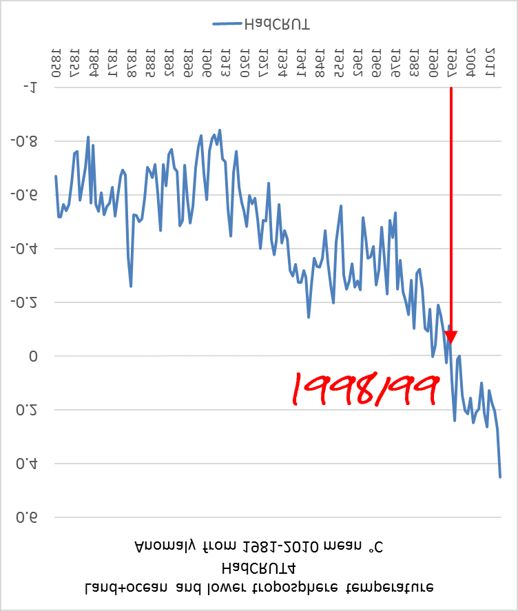
DayHay isn't interested in statistics, eye-balling is good enough for her (or him), preferably after turning the chart upside down.
January 21, 2016 at 1:25 pm
And if I look at the temperature trend for the entire HOLOCENE I see a definite trend. Trends are all over the place. So pick your timeframe and then ask, IS IT SIGNIFICANT. If you cannot see a trend change in global temp graphs starting around 1998-2000 then you are blind or warmist or a liar. The CO2 trend however, looks much more consistent, no concurrent decline like the temp trend. So, is it significant or not? If not, then neither are your “other” 18 years trends where ever they may be. Be anything you like, but damn, be consistent please.
This is how DayHay must be looking at the temperature chart:
Oh there are a lot more conspiracy theories and other foolishness in the rest of the comments, if you care to peruse them. All Anthony Watts has left are the hard core science deniers, which pleases him no end, I'm sure.
From the HotWhopper archives
- Desperate Deniers Part 2: David Middleton fakes a satellite data "Just for grins" - January 2016
- Desperate Deniers Part 3: Rud Istvan mixes up GISTemp data versions - January 2016
- Desperate Deniers Part 4: Anthony Watts is shame-proof despite all his bloopers about NOAA - January 2016
- Desperate Deniers Part 5 - Anthony "surface station" Watts flunks NOAA temperature chart 101 - January 2016
- 2015 is the hottest year on record by a massive 0.13°C - January 2016
Deniers need to get together and work up a decent strategy, because 2016 could be yet another hottest year on record
ReplyDeleteSadly, science shows that the weighted sum of the deniers' strategic intelligence is close to zero and may not be effective.
For i = 1 to n, Σ(Dᵢ*Sᵢ) ≈ 0
Note that I invoke WUWT standards of proof. I have typed it out, therefore it must be true.